










ART DIRECTOR AND SENIOR DESIGNER /
Art director and brand designer with 20+ years of experience building and scaling visual identities for global, performance-driven brands. Leads creative from concept through production across digital, print, retail, and physical products, translating complex brand standards into consistent, high-quality woArt director and brand designer with 20+ years of experience building and scaling visual identities for global, performance-driven brands. Leads creative from concept through production across digital, print, retail, and physical products, translating complex brand standards into consistent, high-quality work across markets. Partners with marketing, product, and executive stakeholders and manages design teams.
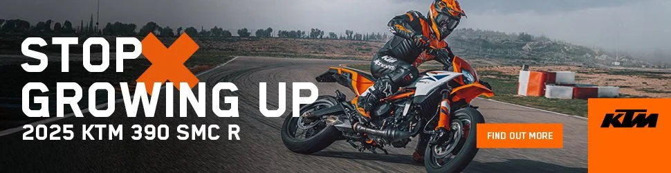
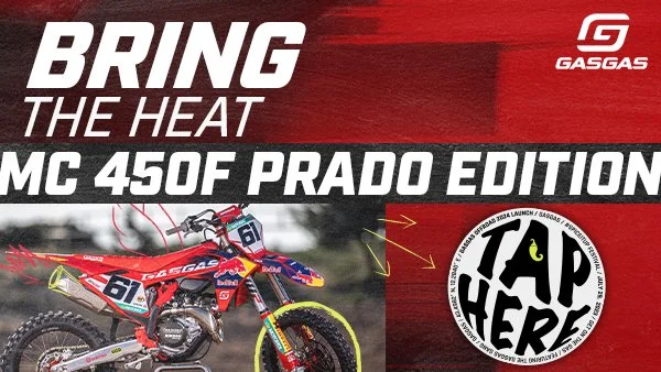
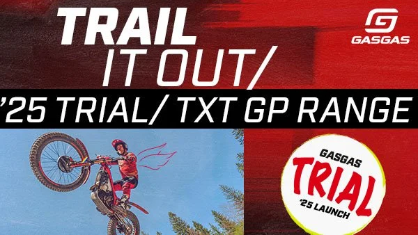
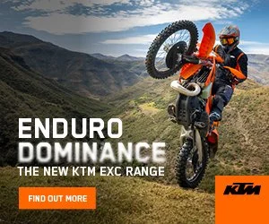
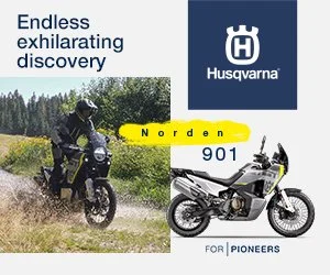
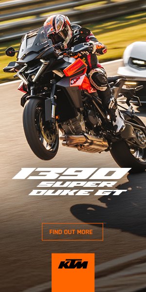
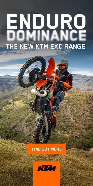
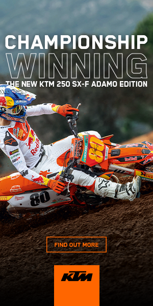
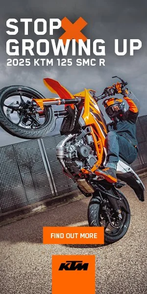
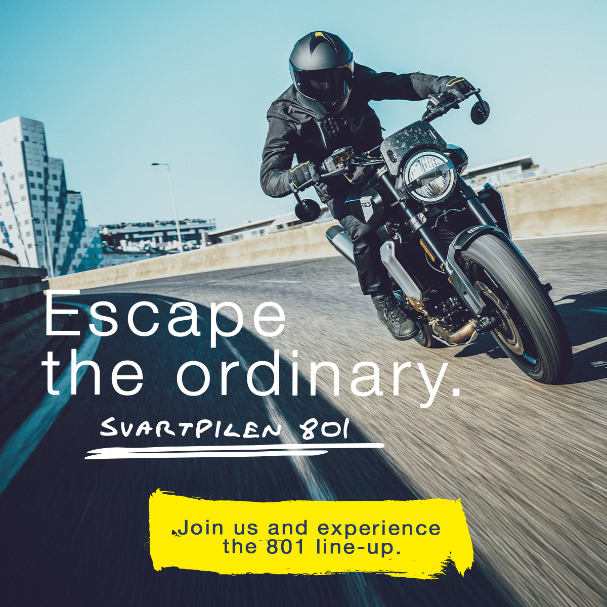
This work spanned concurrent design initiatives across digital, print, events, and dealership marketing for a global motorsports client operating across multiple regions. The challenge was maintaining one coherent brand system while adapting creative for regional and market-specific needs, campaigns that felt locally relevant without fragmenting the brand. That meant close partnership with marketing, sales, and events teams to shape creative that served both global brand consistency and local business goals, while keeping production standards high across a high volume of concurrent deliverables.
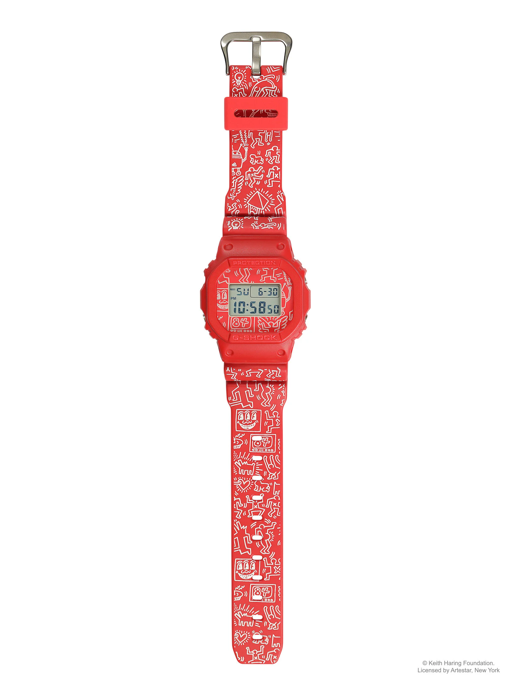
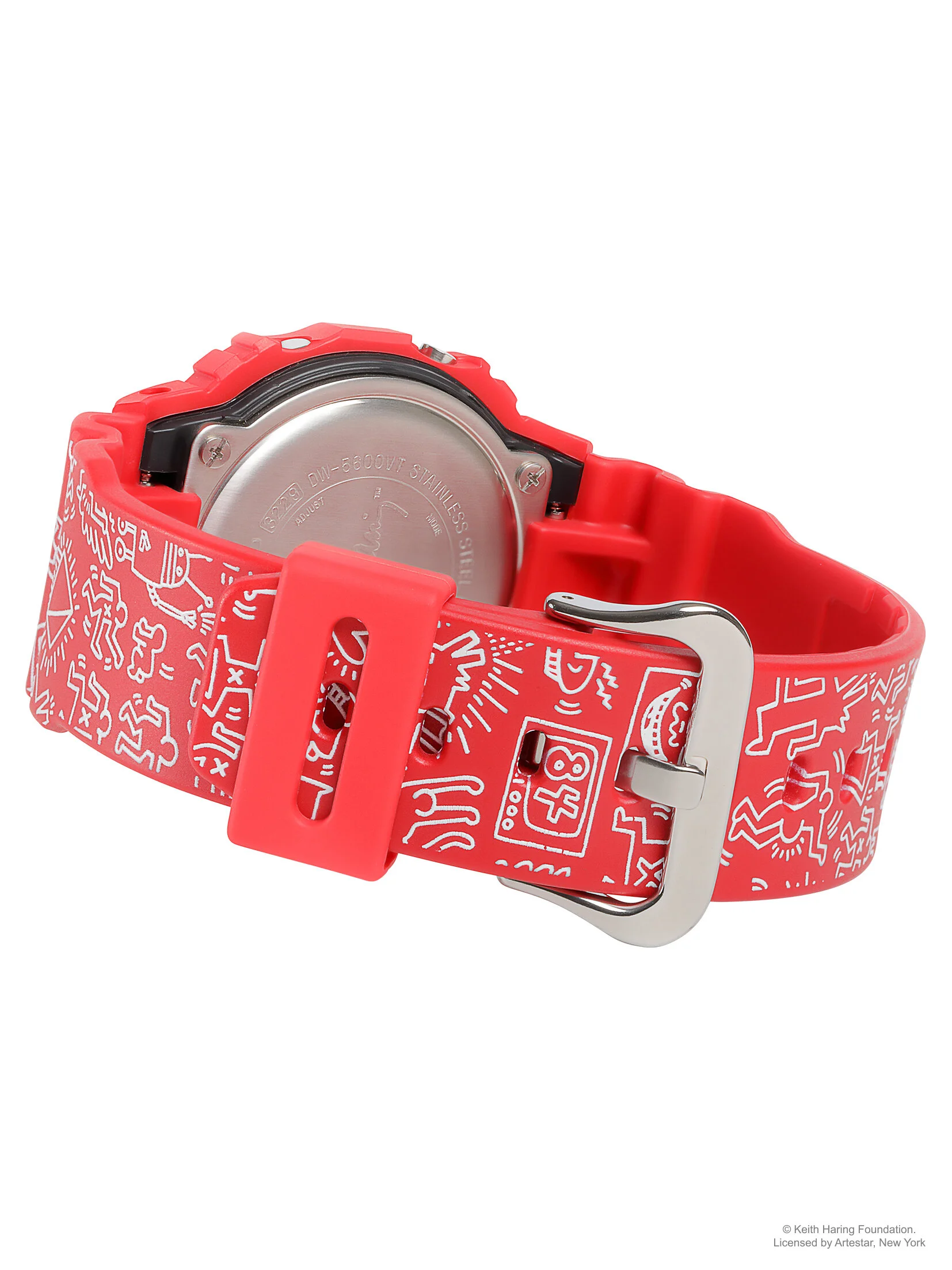
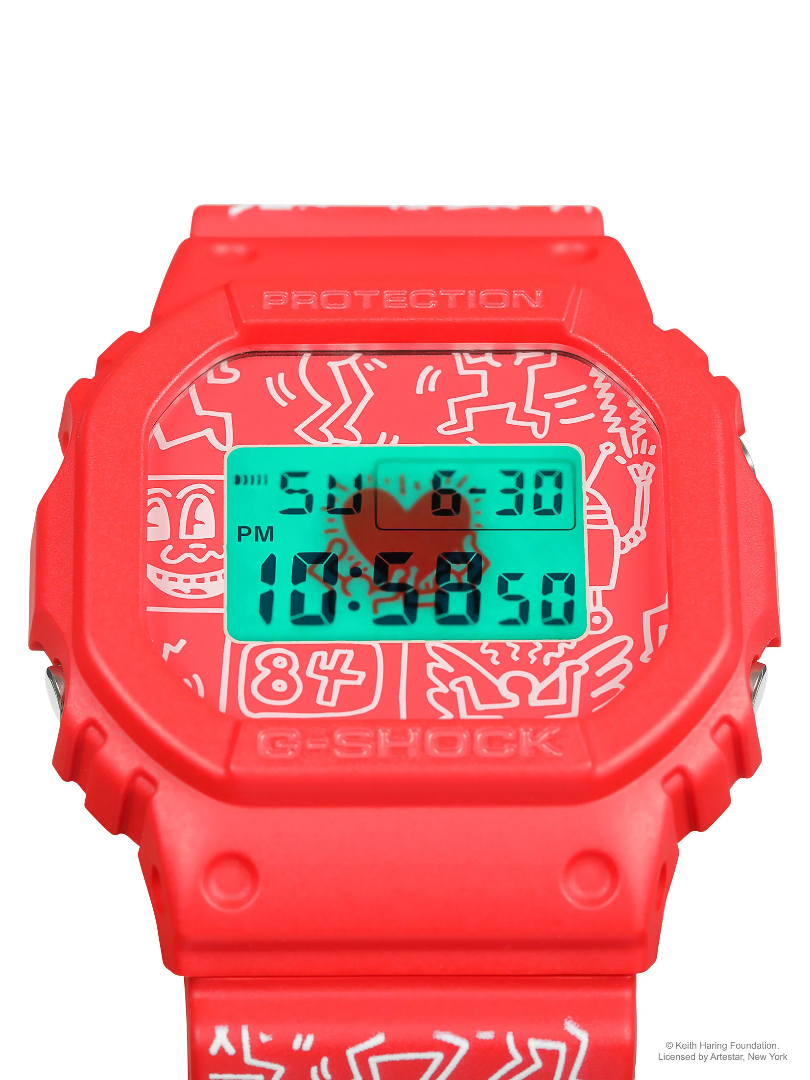
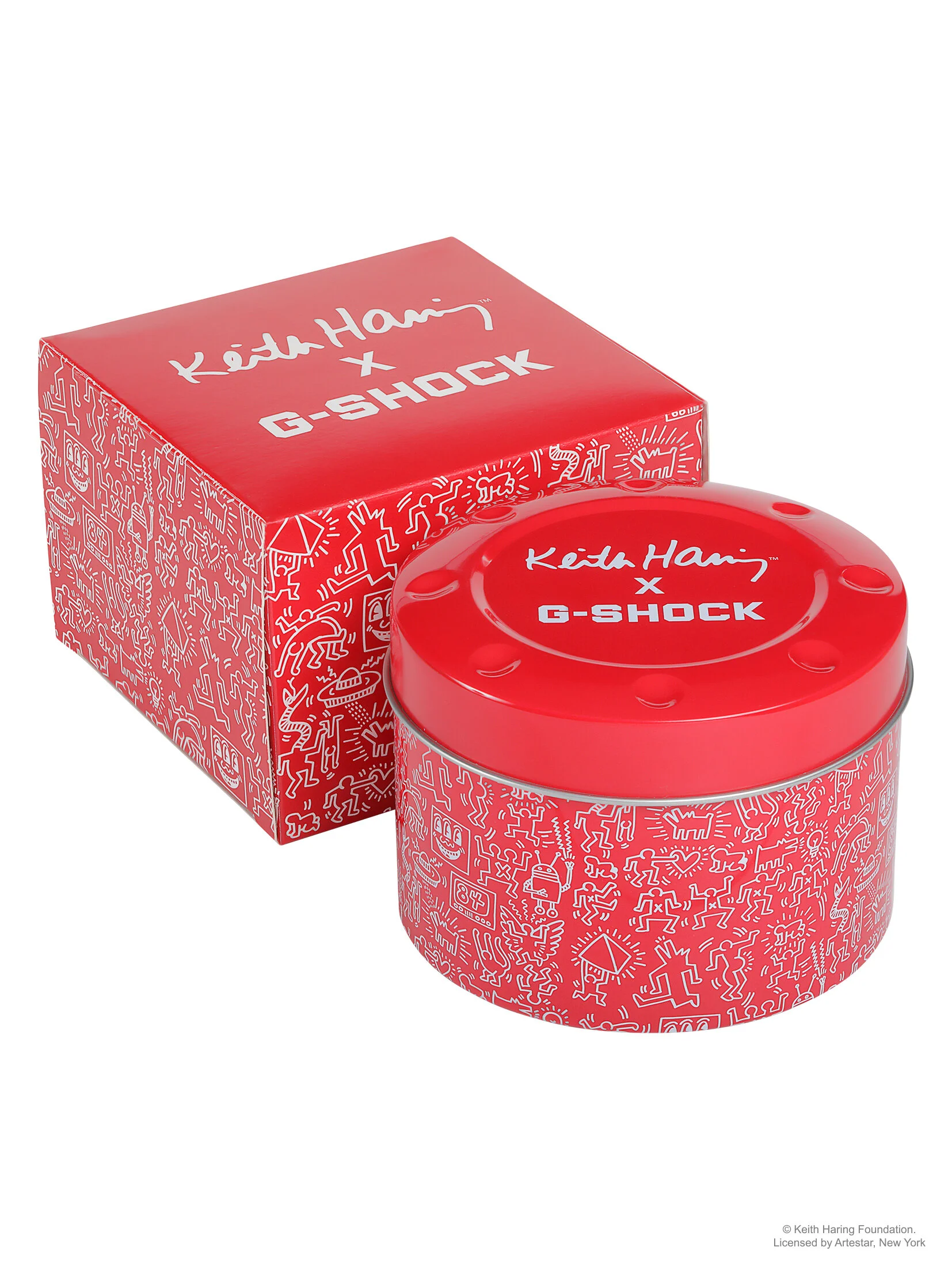
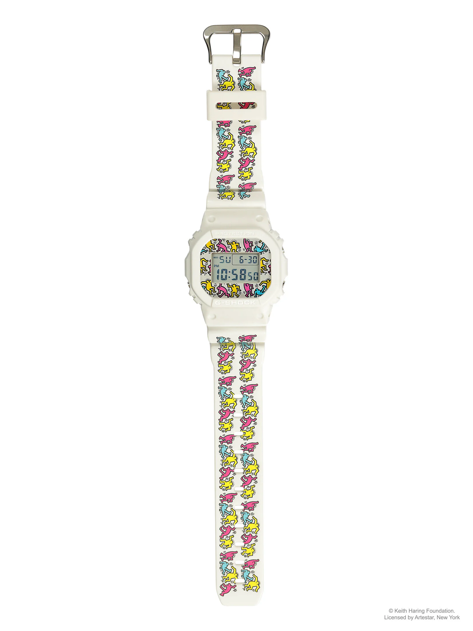
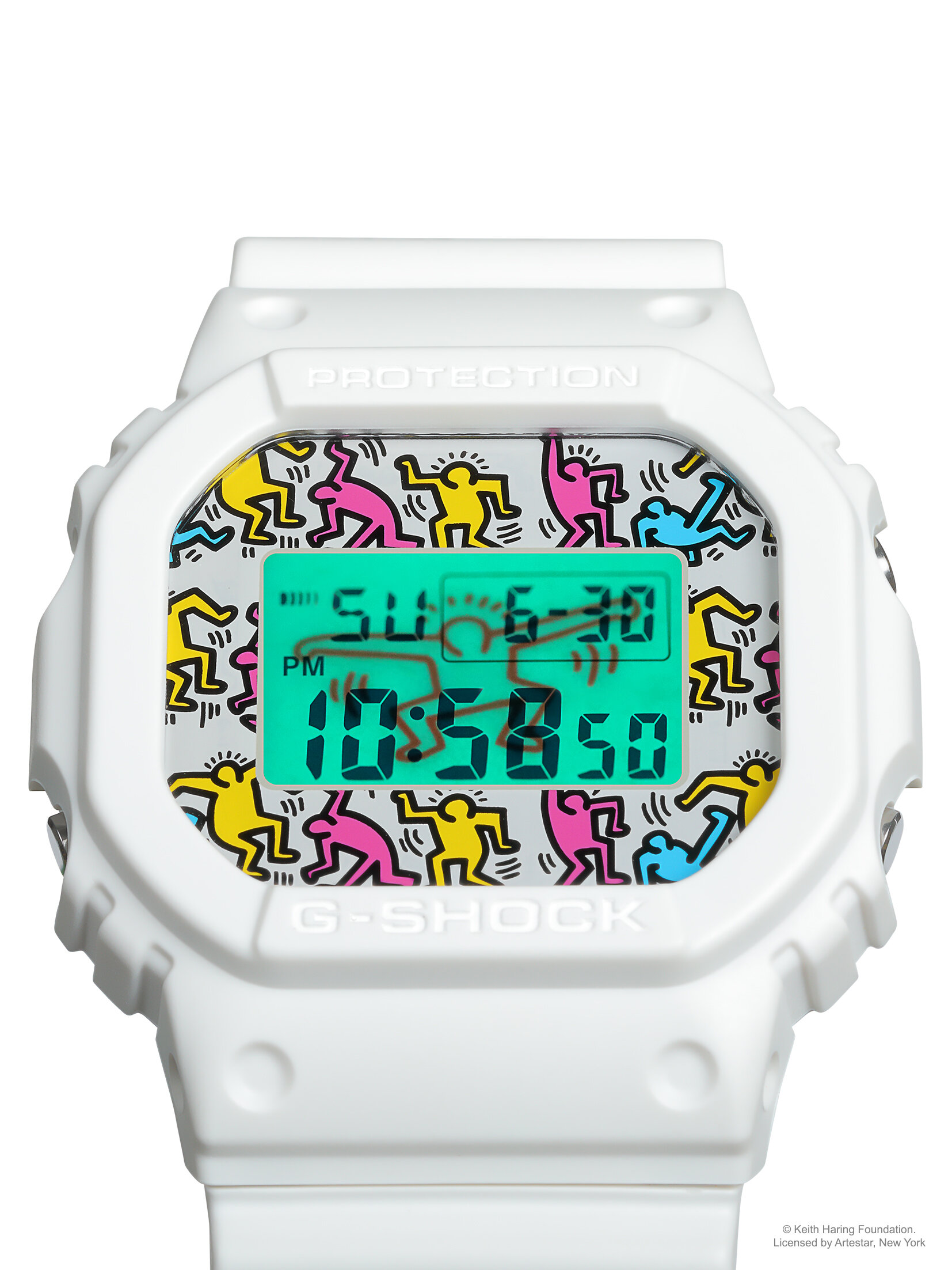
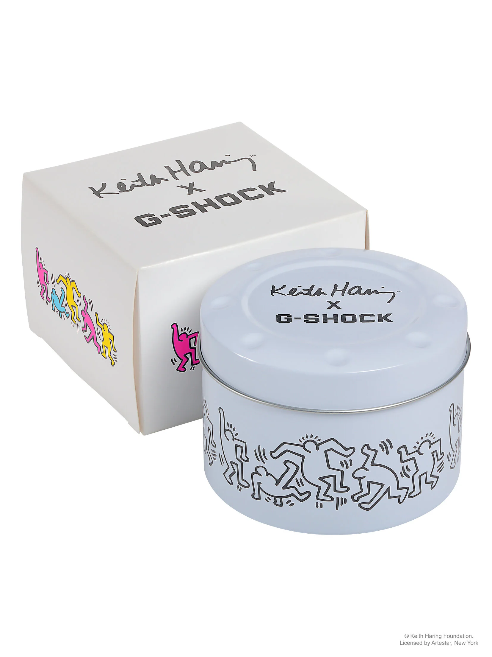
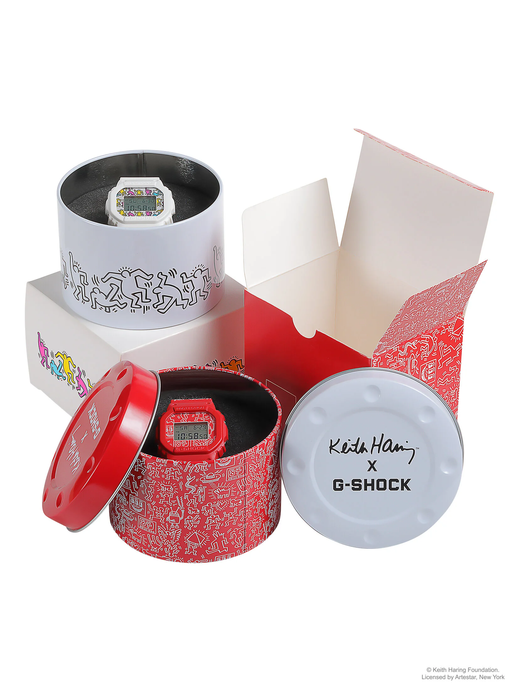
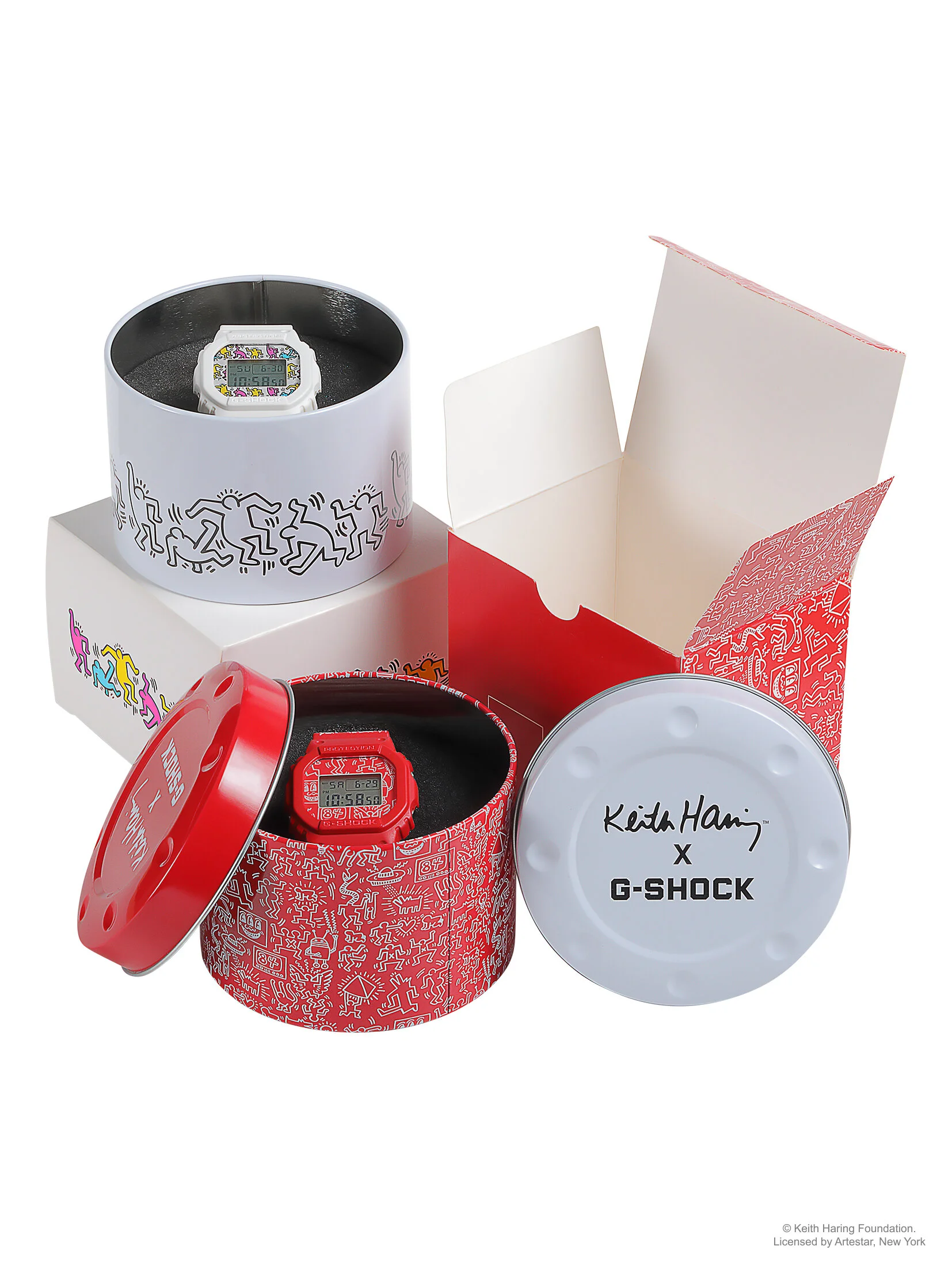
For this collaboration, the goal was to honor Keith Haring's visual language, bold line work, radiant figures, dense pattern, without reducing it to a licensed print applied to a product. The work involved translating Haring's archive into a cohesive system across the watch itself, packaging, and supporting campaign materials, staying true to the energy and spirit of the original art while making it feel intentional on a modern consumer product. Every touchpoint, from the retail unboxing experience to campaign imagery, was built to carry the same visual DNA, so the collaboration read as a genuine tribute rather than a co-brand exercise.
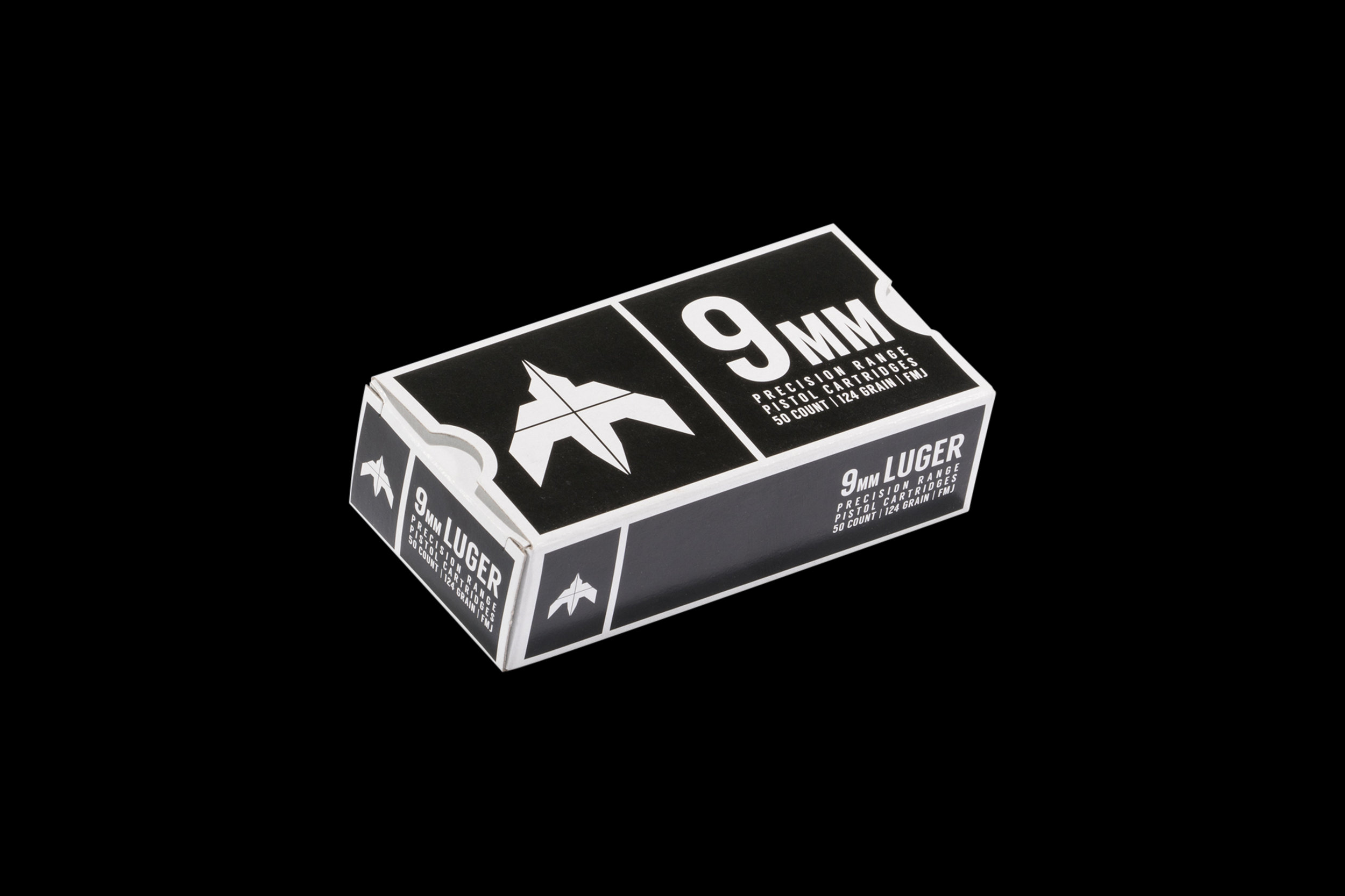
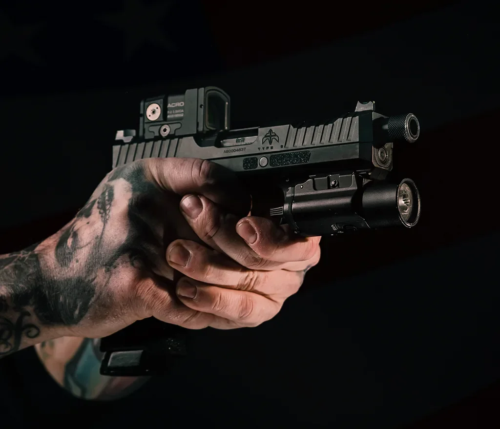
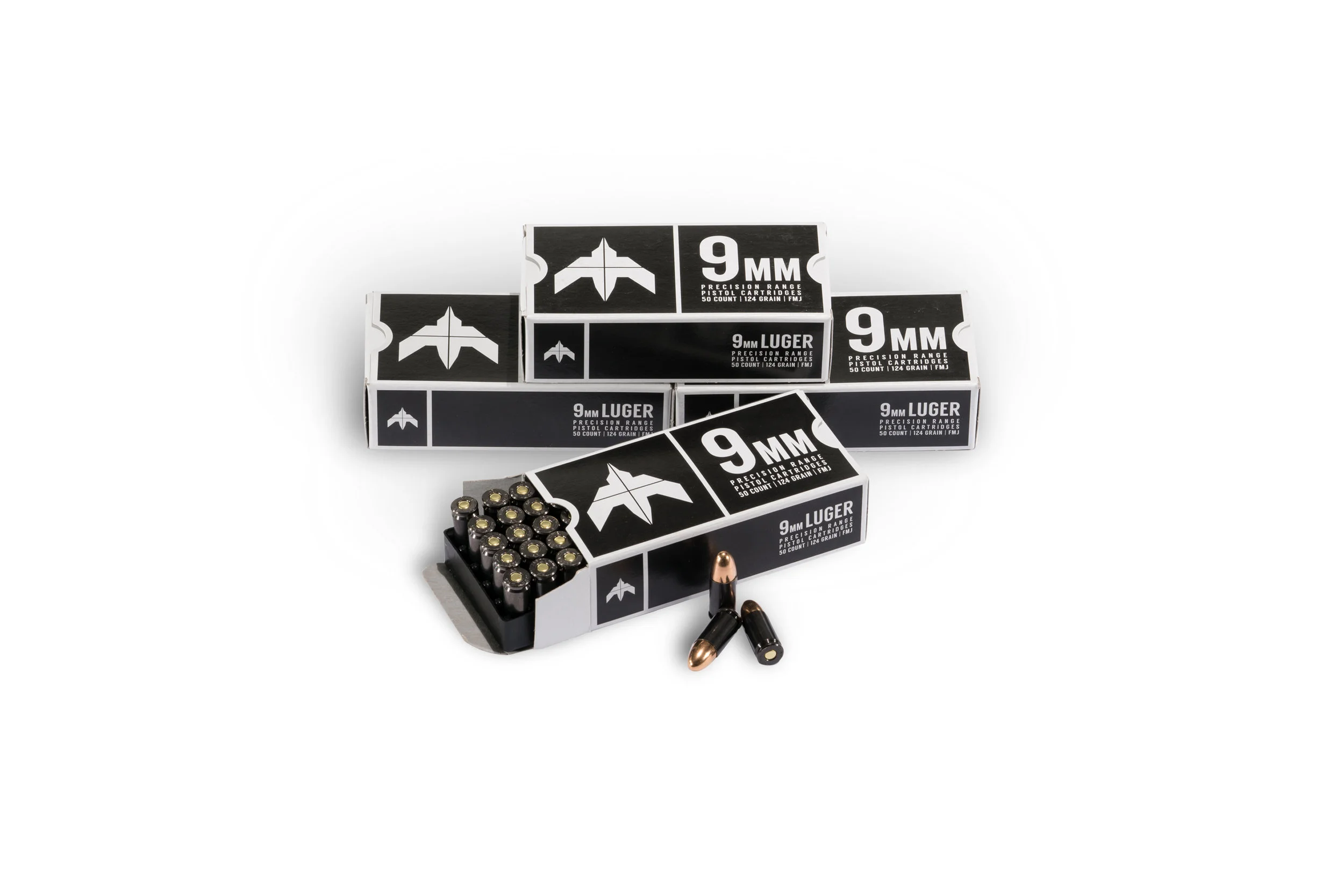
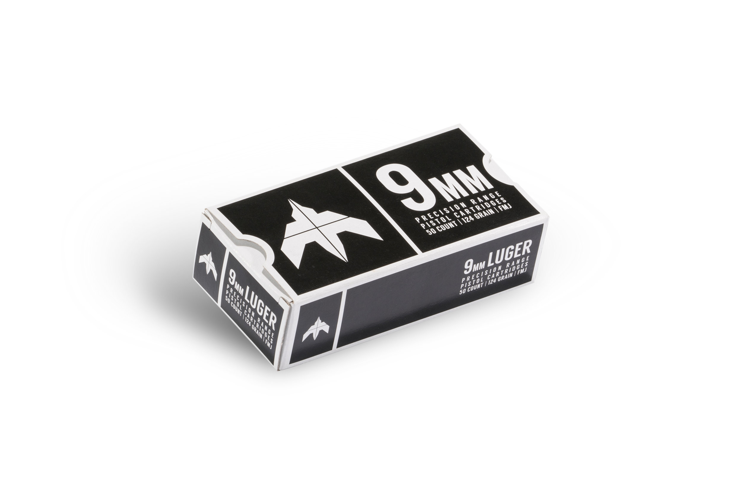
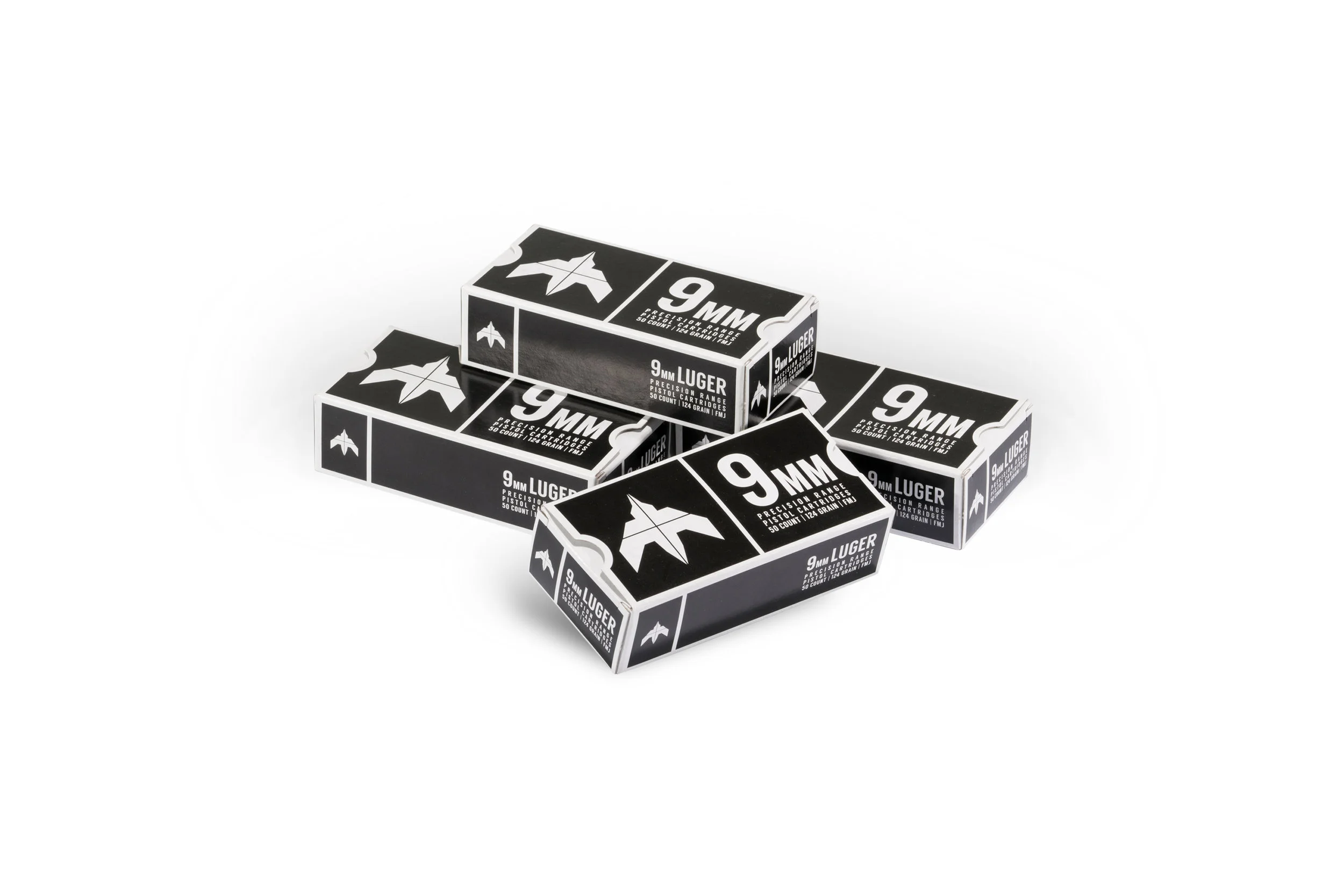
Ammunition is a category where brand differentiation is rare, most competitors lean on utilitarian, interchangeable design language. The opportunity here was to build a visual identity with more intention: distinct packaging, a clear brand system, and creative that gave the product a stronger shelf and market presence than the category norm. The result is a brand that stands apart through design rigor in a space where most competitors don't invest in one.
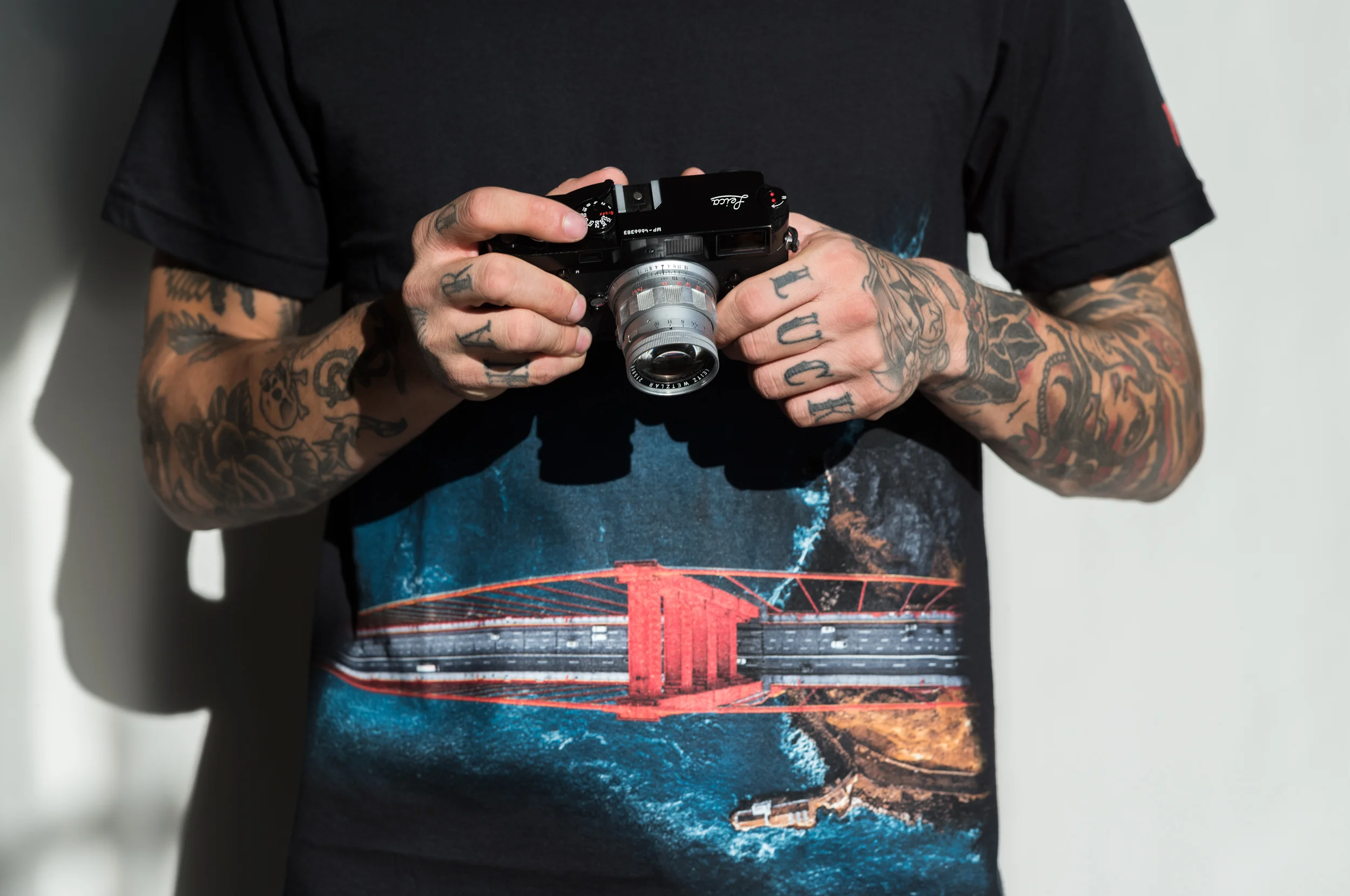
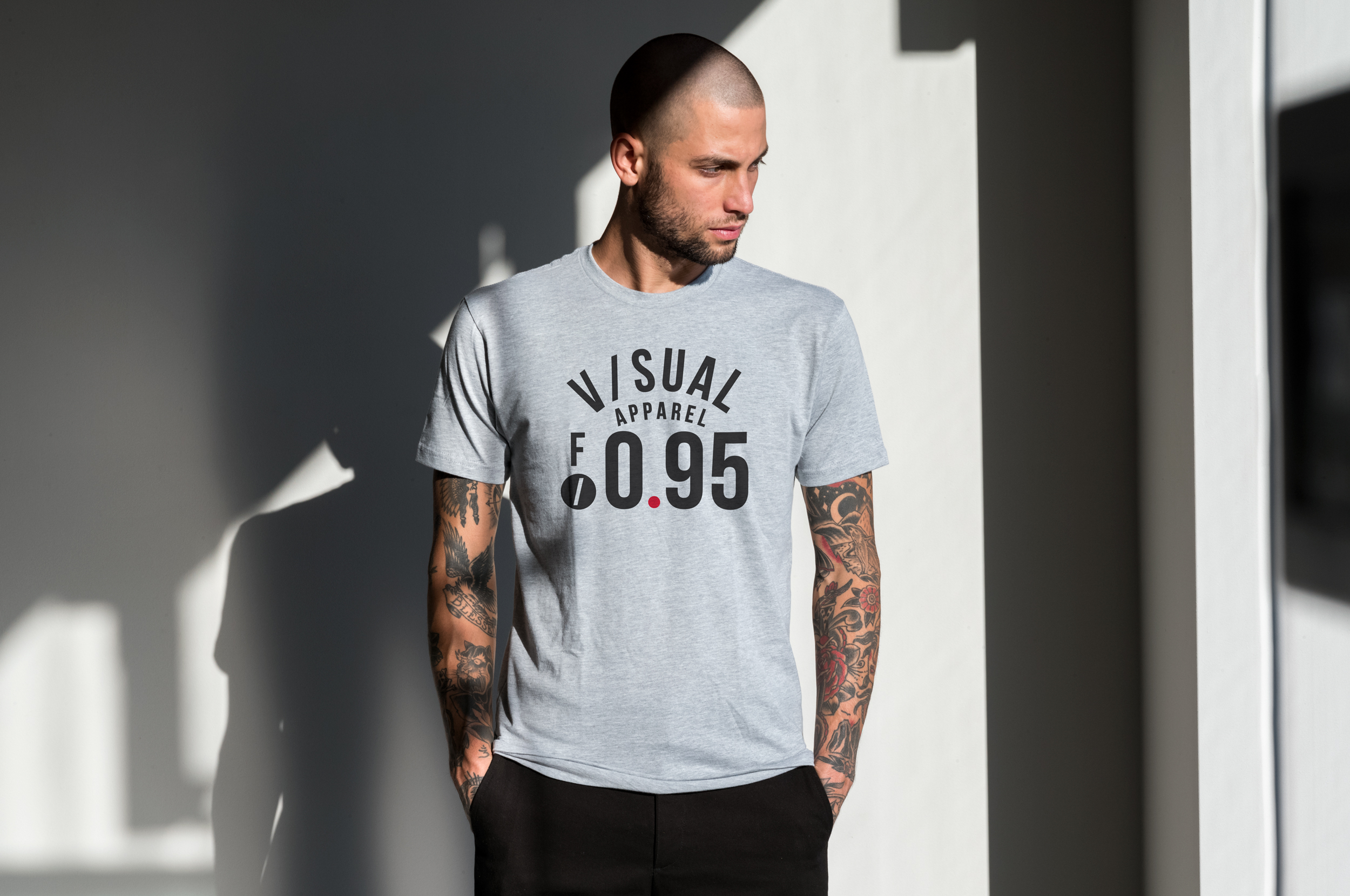
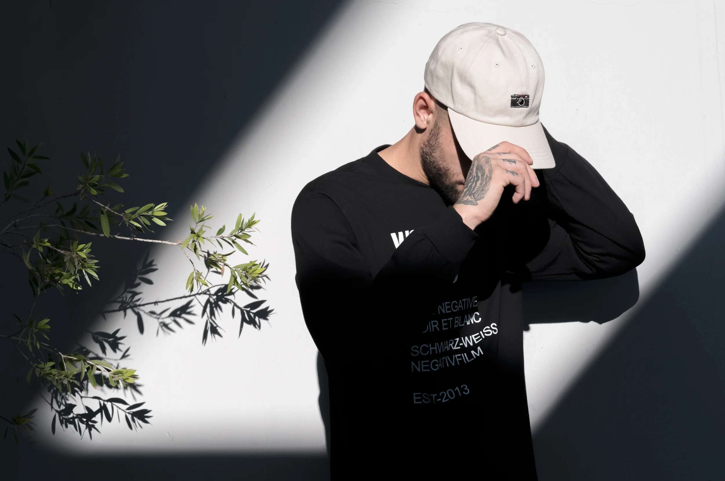
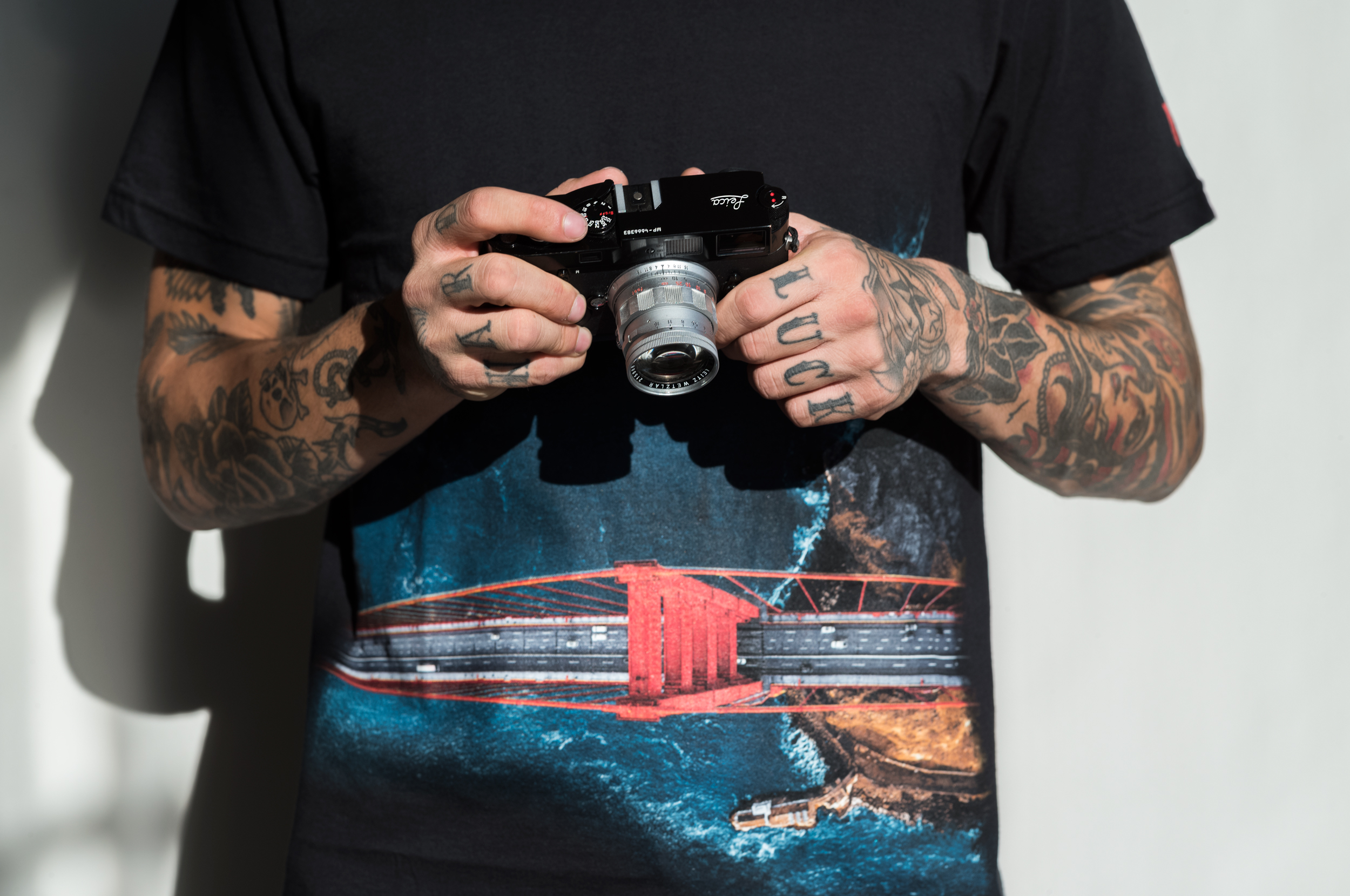
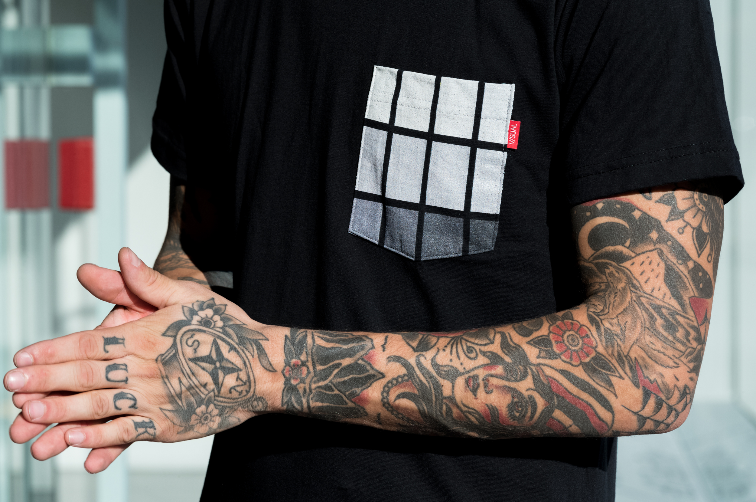
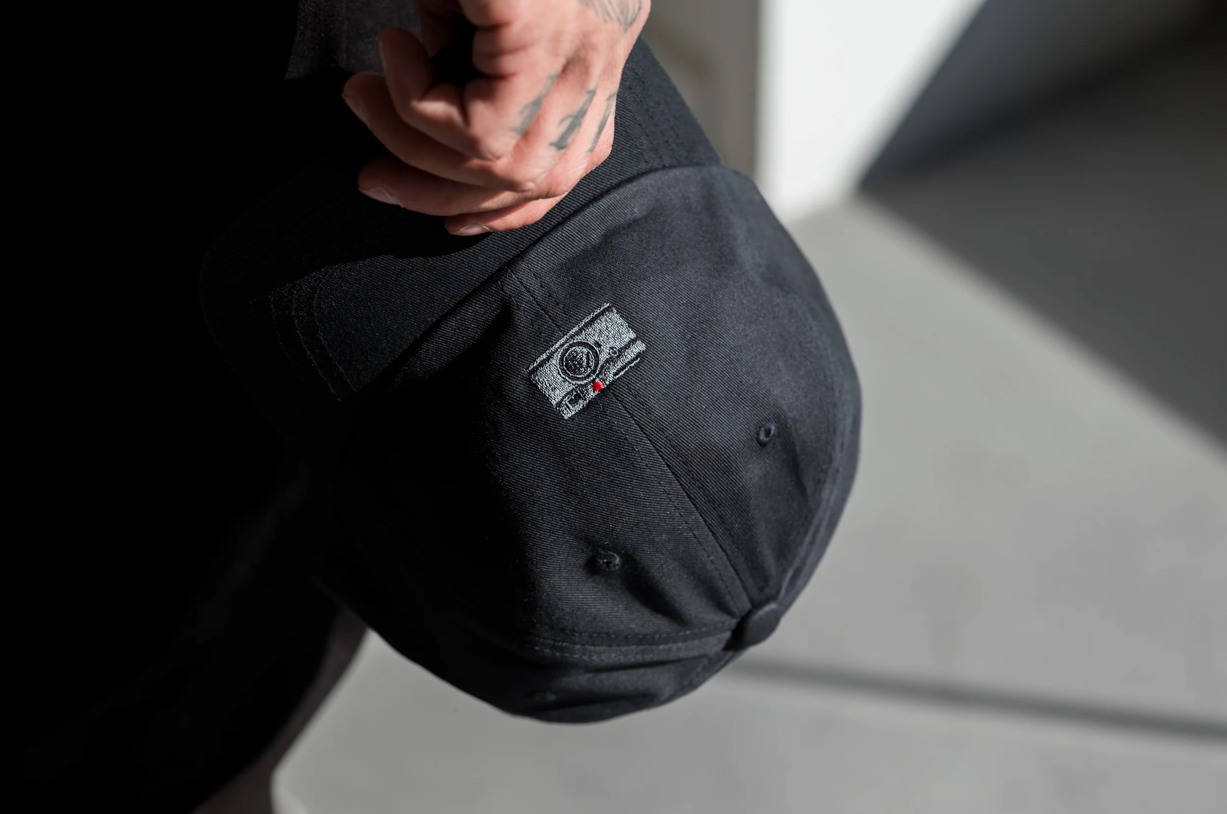
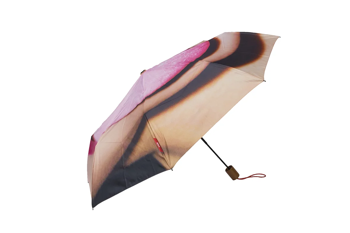
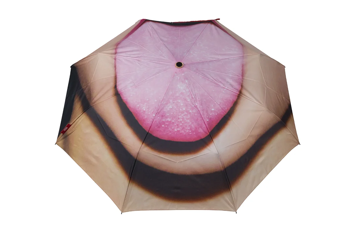
V/SUAL was one of a small, hand-selected group of brands invited to collaborate with Leica, developing product for sale in Leica's flagship stores across the U.S. Shown here is a selection from V/SUAL's first release with Leica, work I contributed to across product design, brand collaboration, and visual storytelling.
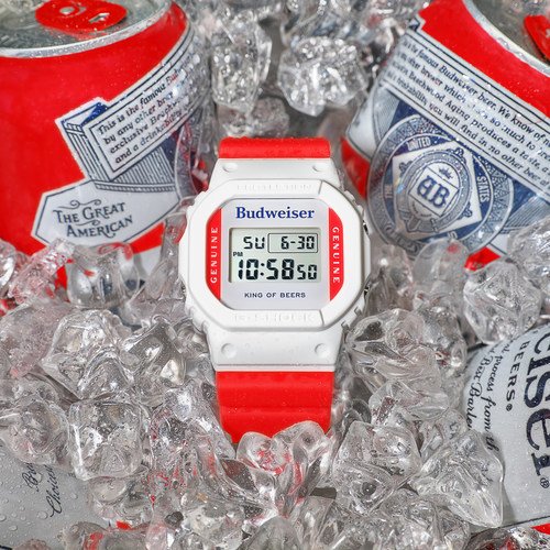
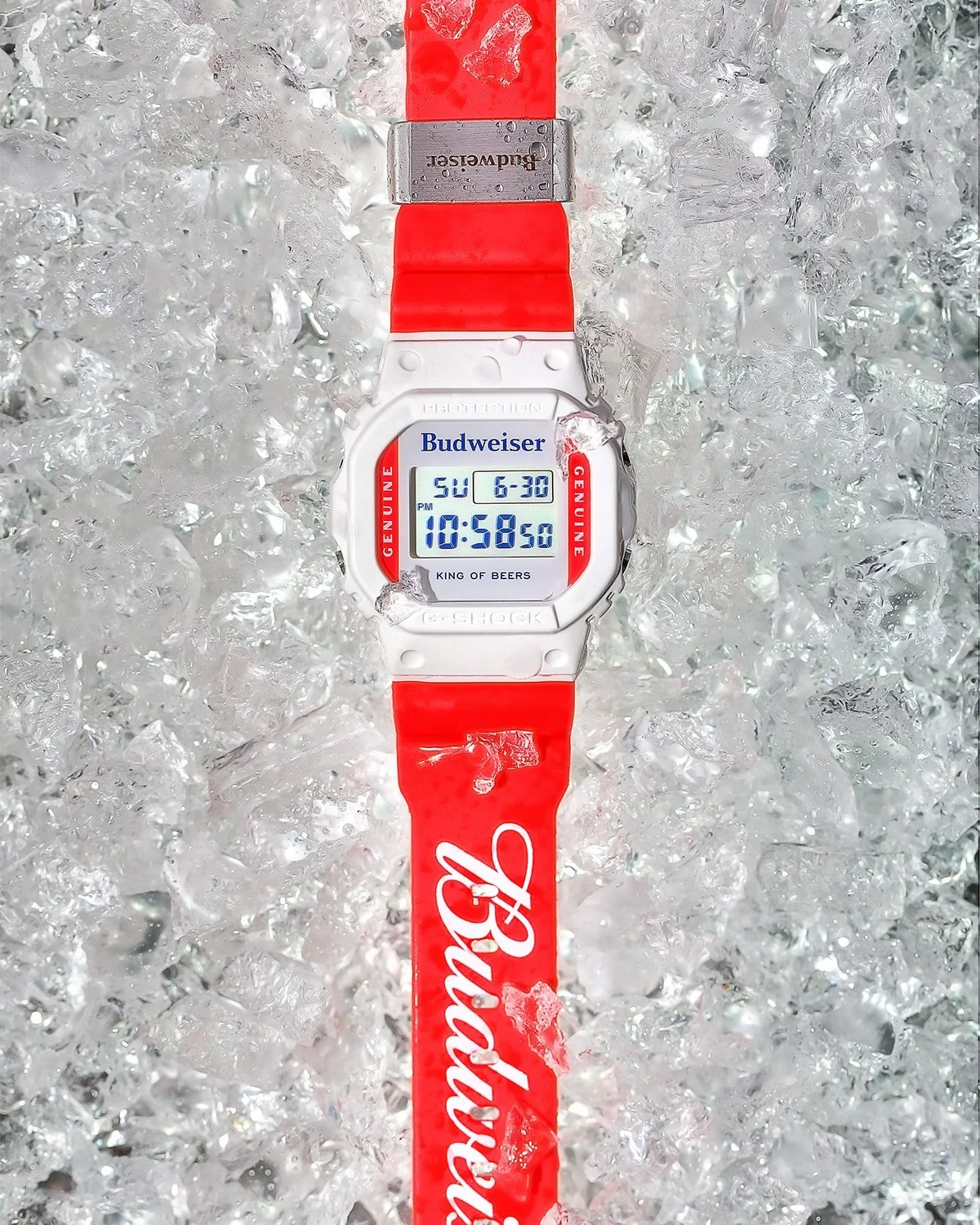
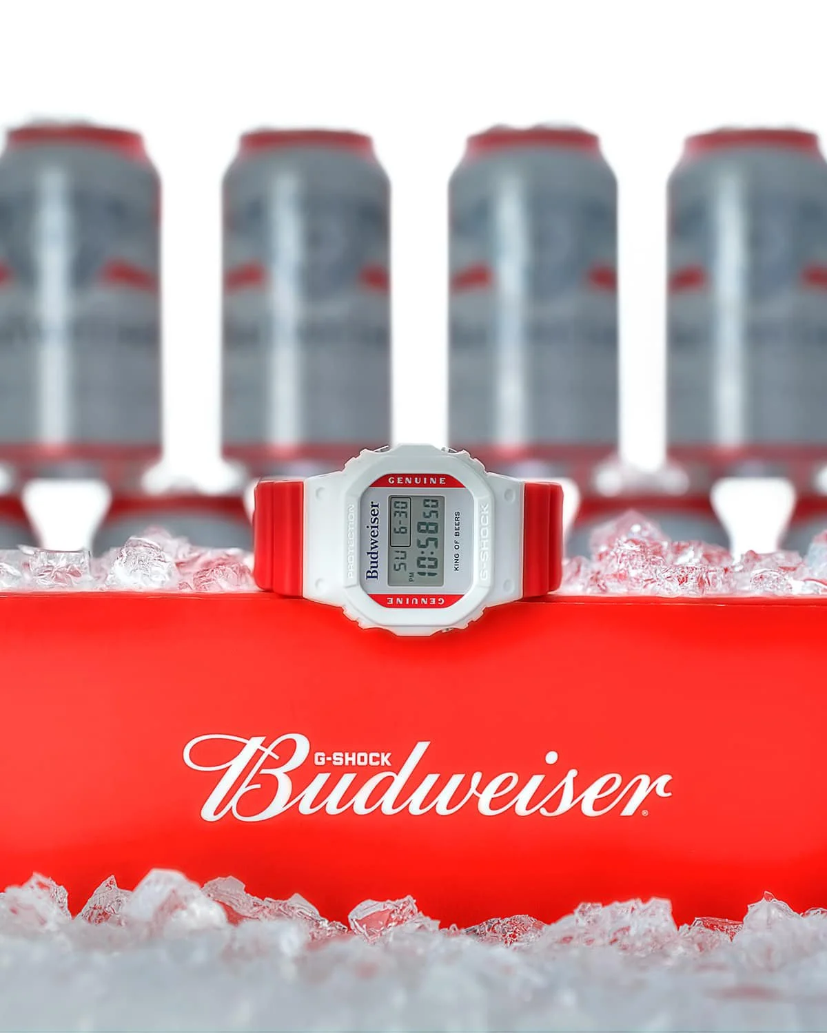
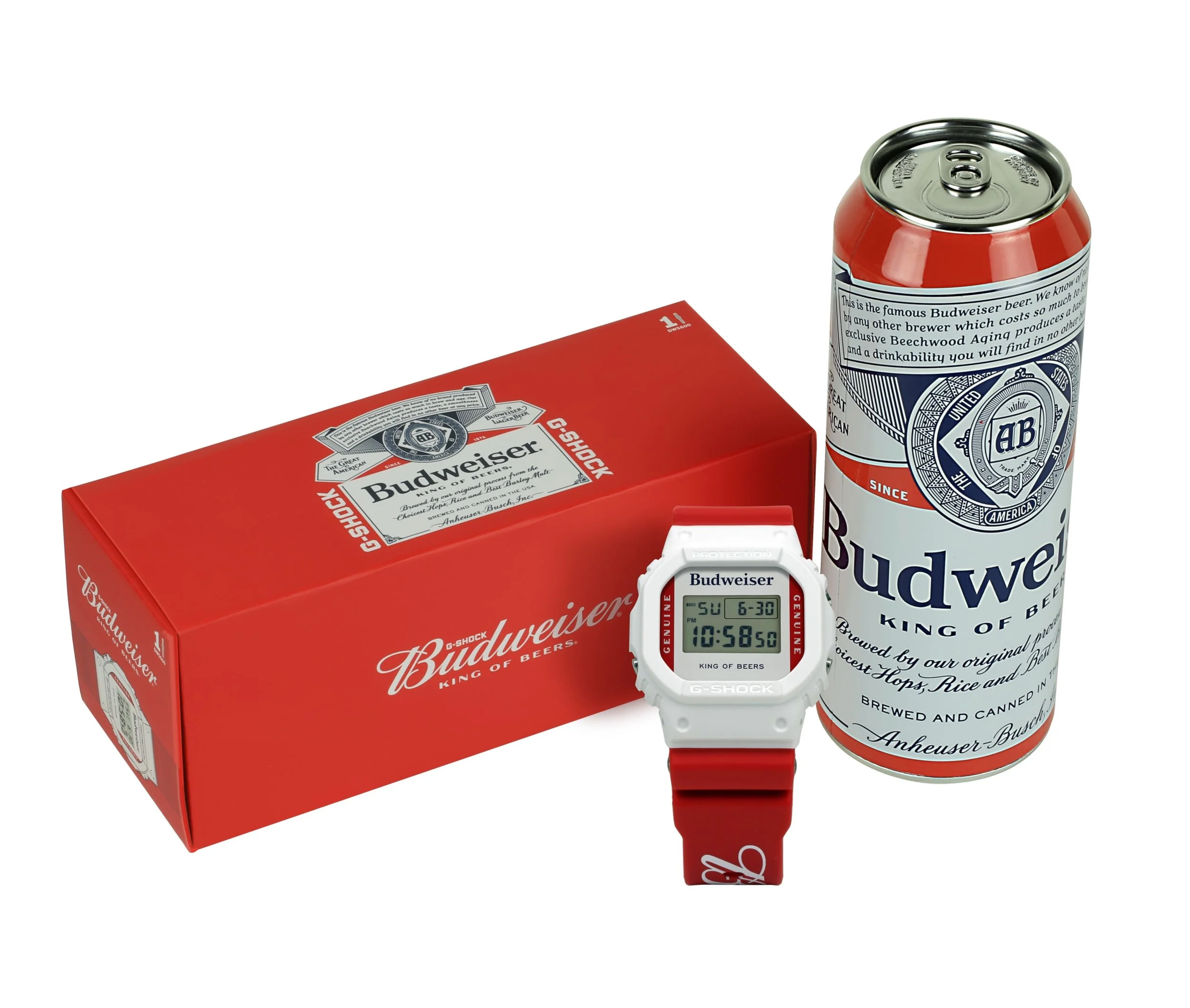
This collaboration paired G-SHOCK's classic DW5600 with Budweiser's brand heritage, resulting in a limited-edition timepiece built around Budweiser's red, white, and eagle-emblem identity. I led the concept and design, working directly with Budweiser's licensing team to make sure every detail, from the case back engraving to the backlight graphic, felt authentic to both brands rather than a simple logo slap.
The packaging was where the concept really came together: a custom-built case designed to replicate a 25oz Budweiser can, complete with a false bottom to house the watch, packaged inside a box built to look like a 24-pack case of beer. The goal was to make the unboxing itself feel like part of the collectible, extending the collaboration beyond the product and into the full retail experience.
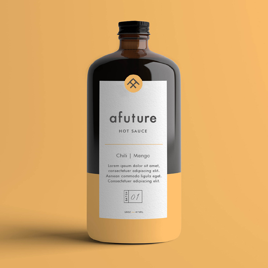
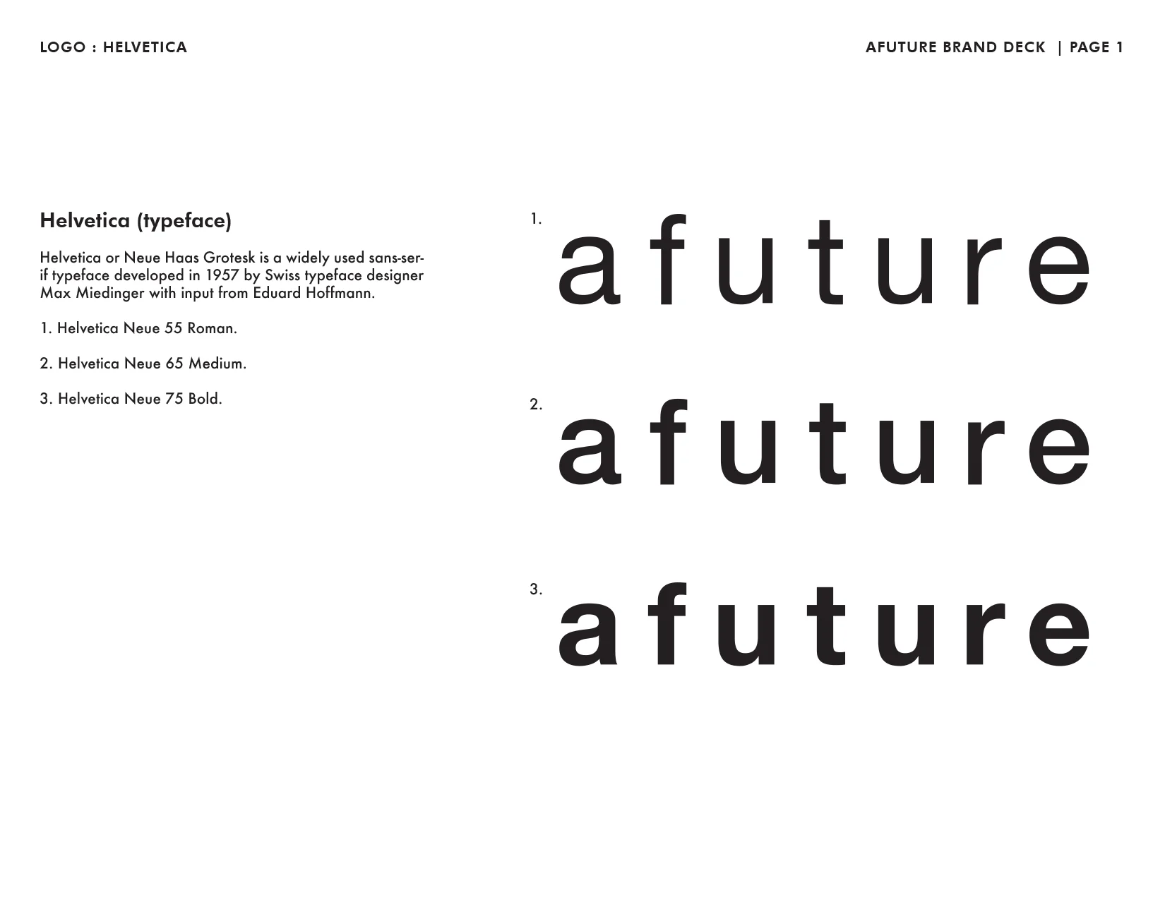
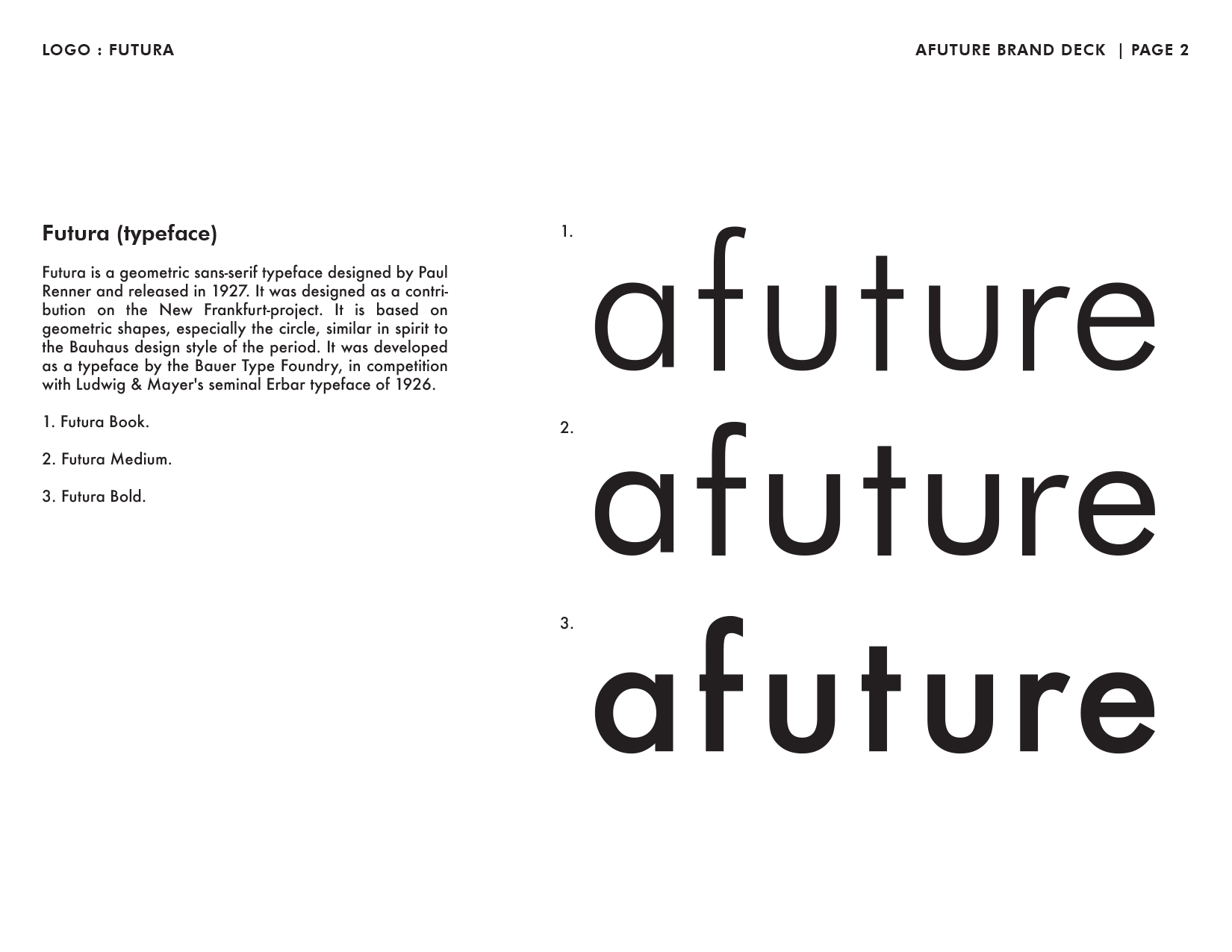
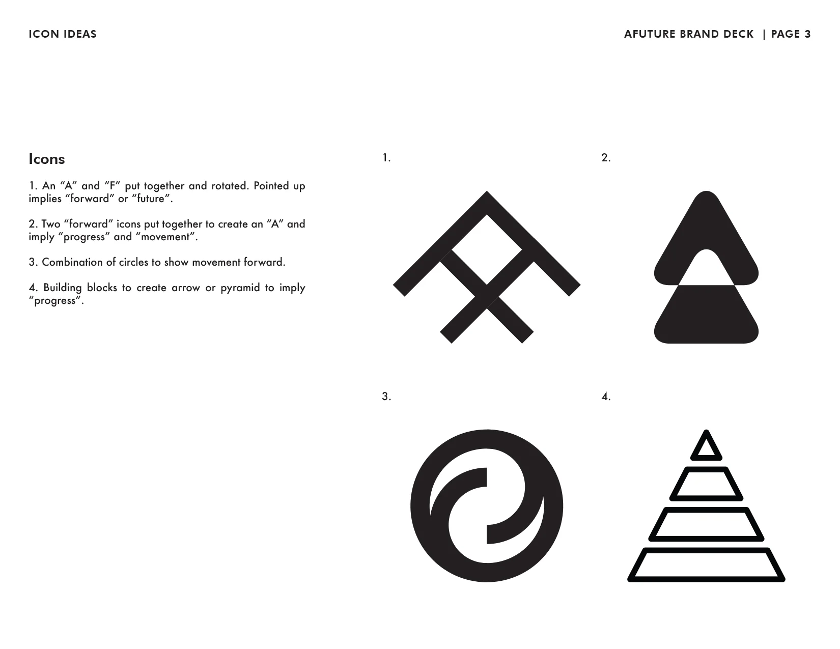
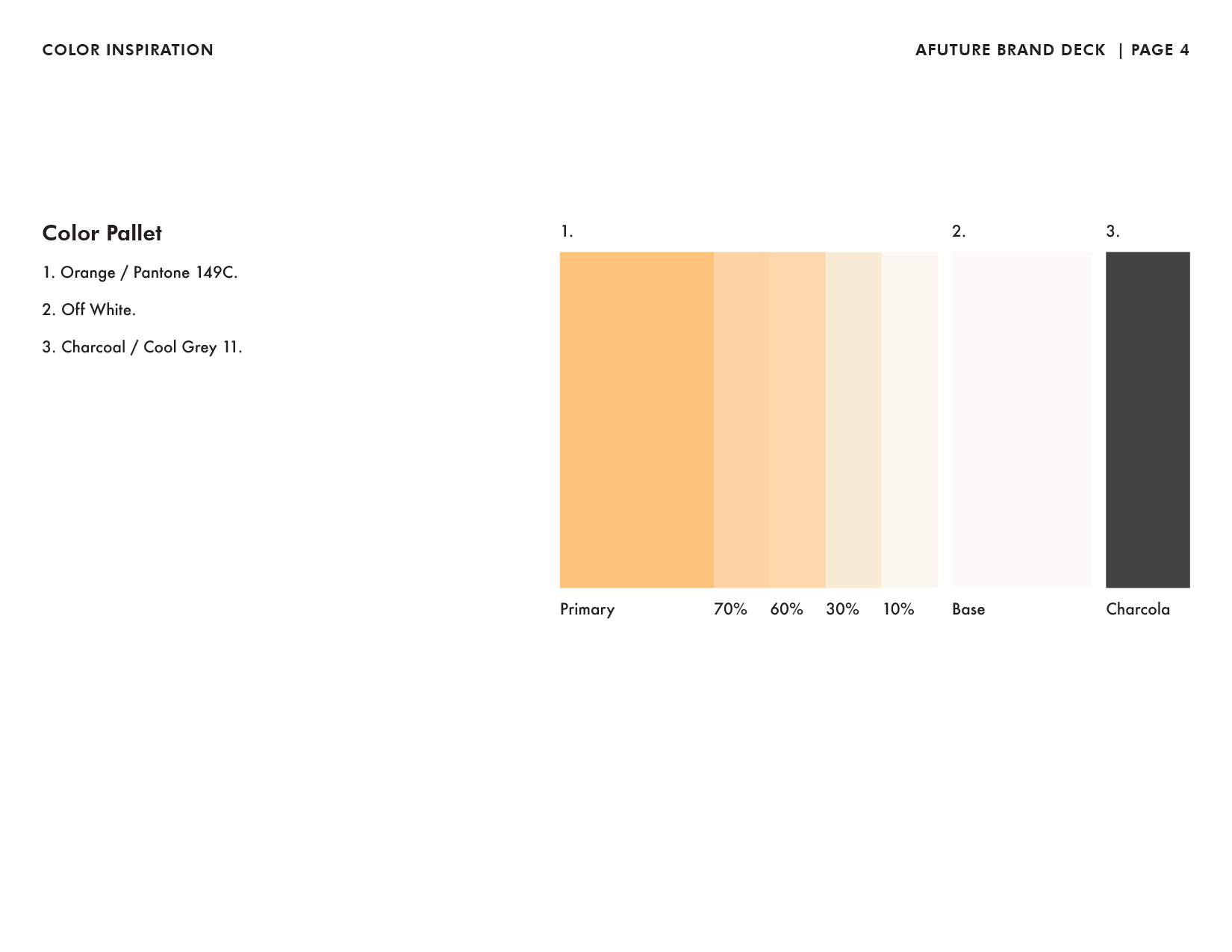
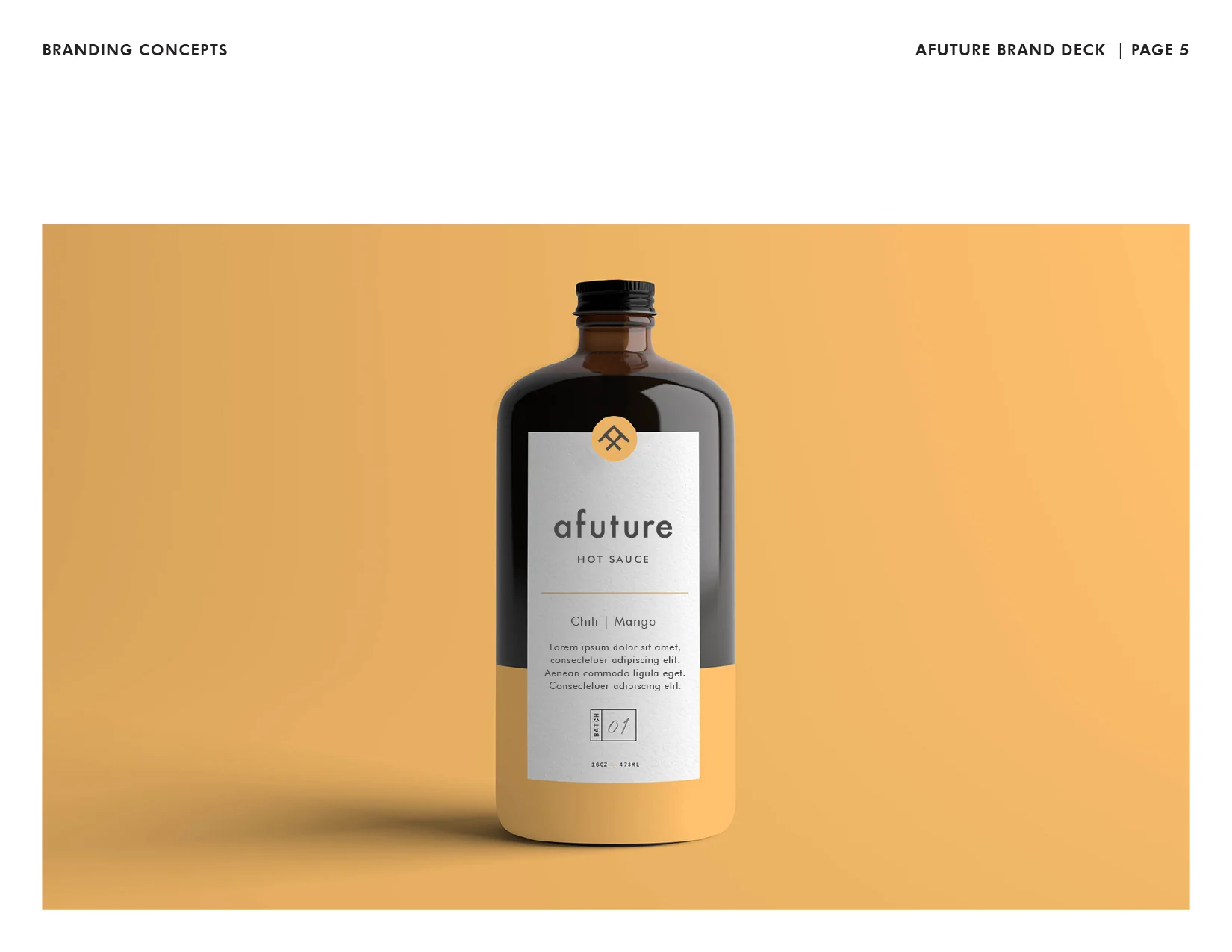
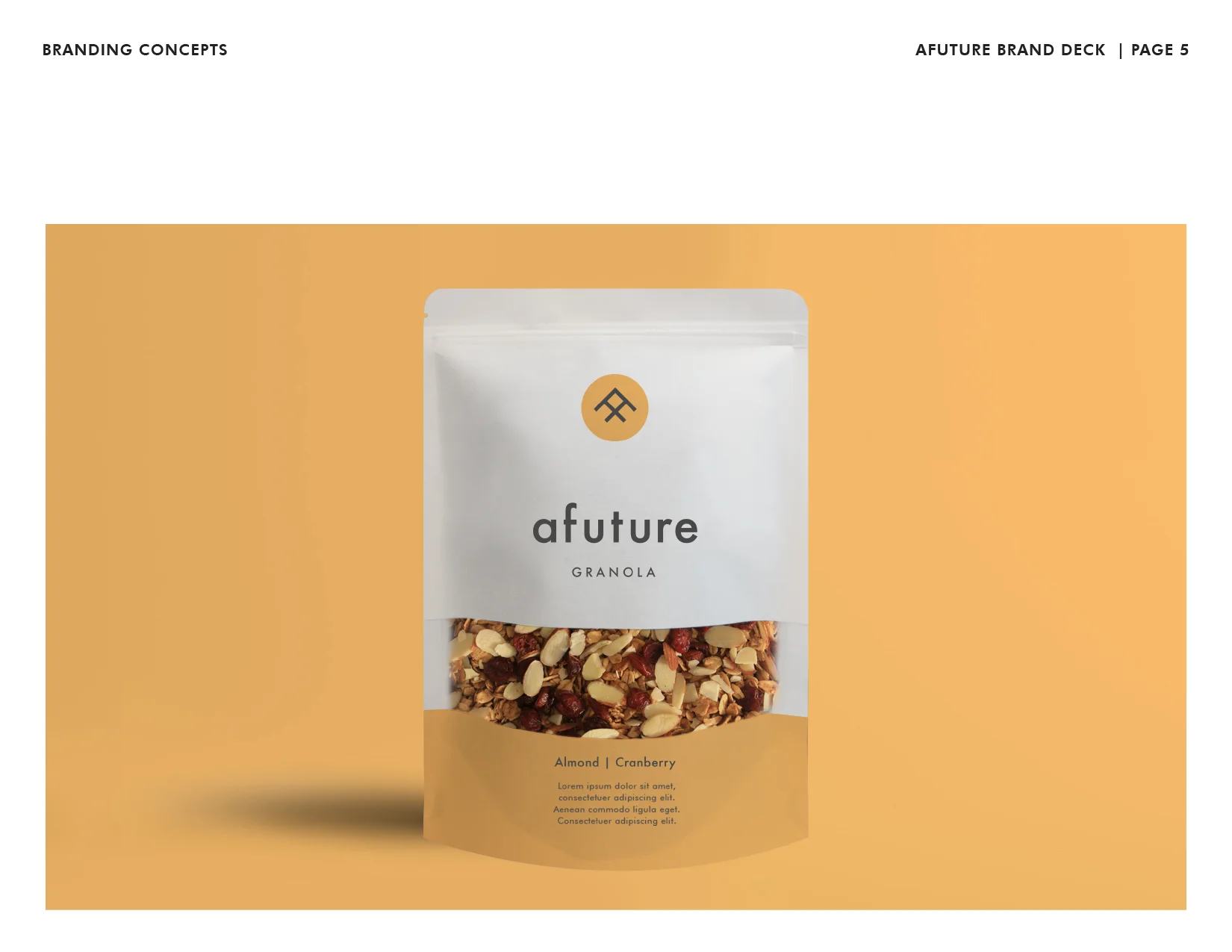
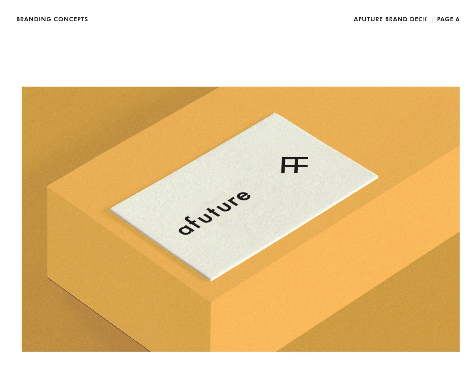
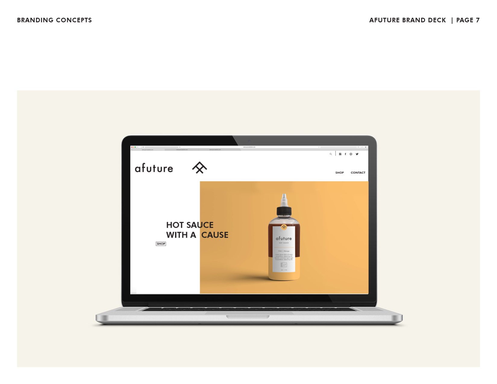
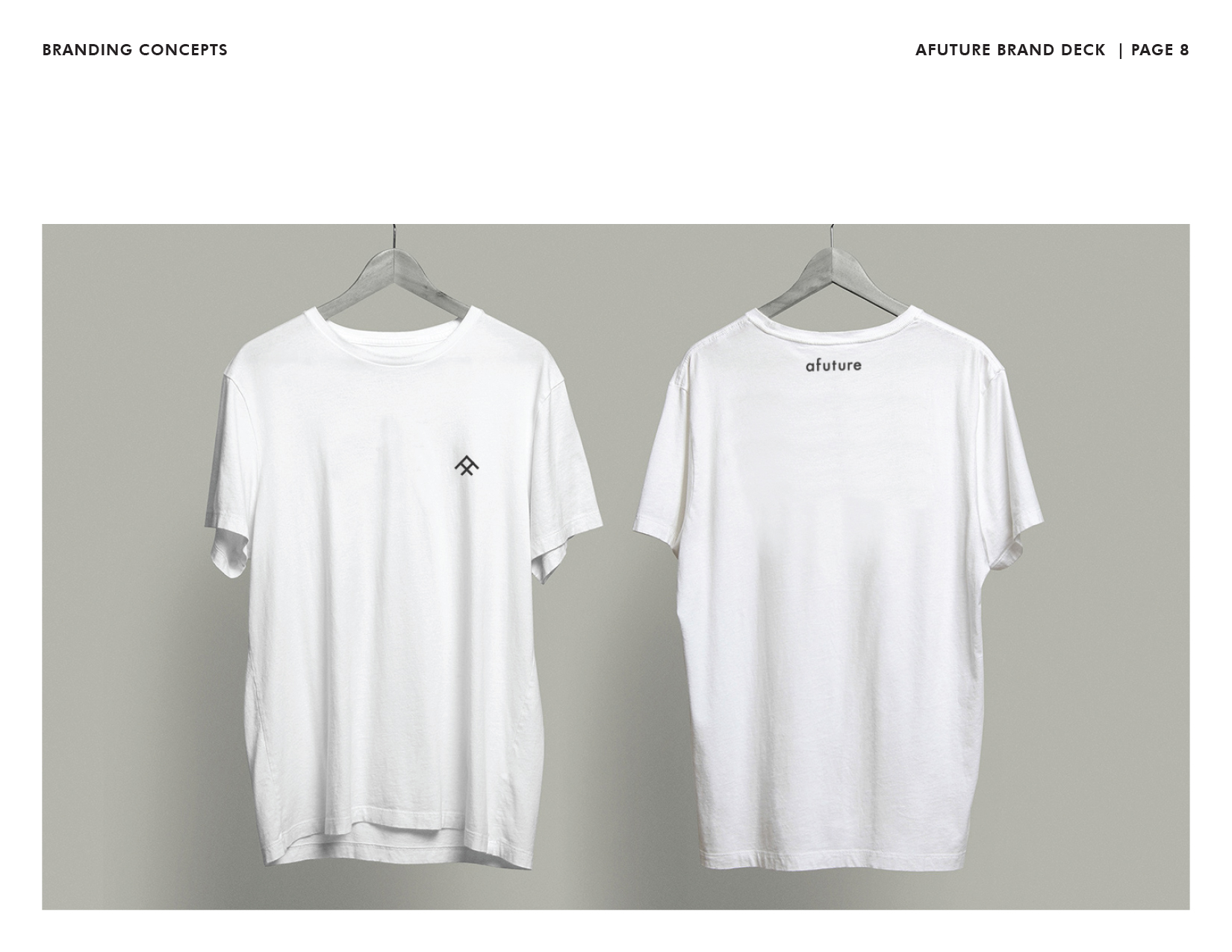
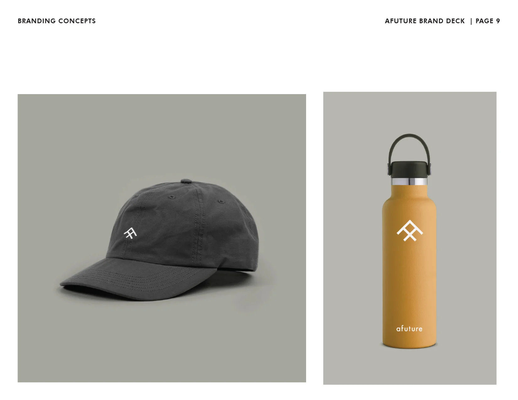
Created a complete brand identity for Afuture, including logo design, iconography, typography, color palette, packaging, and brand guidelines. Developed a cohesive visual system designed to scale consistently across products, packaging, digital experiences, and marketing communications.
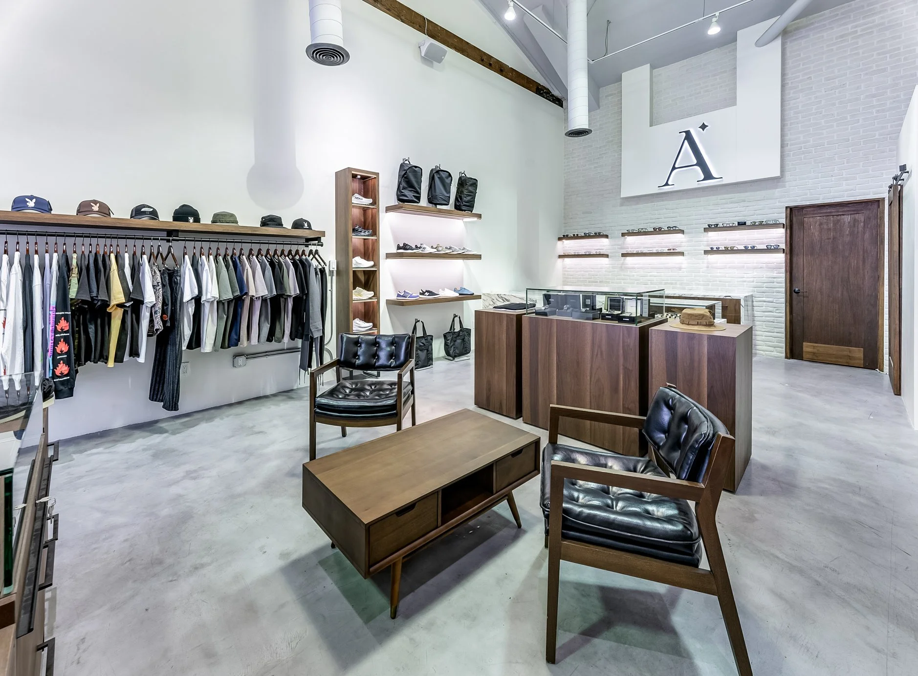
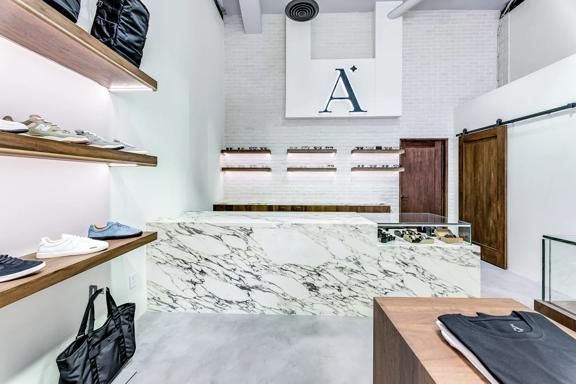
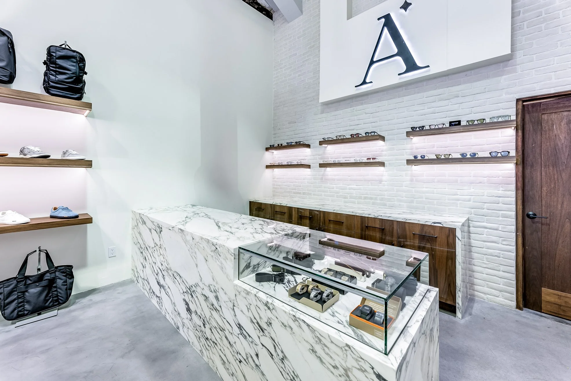
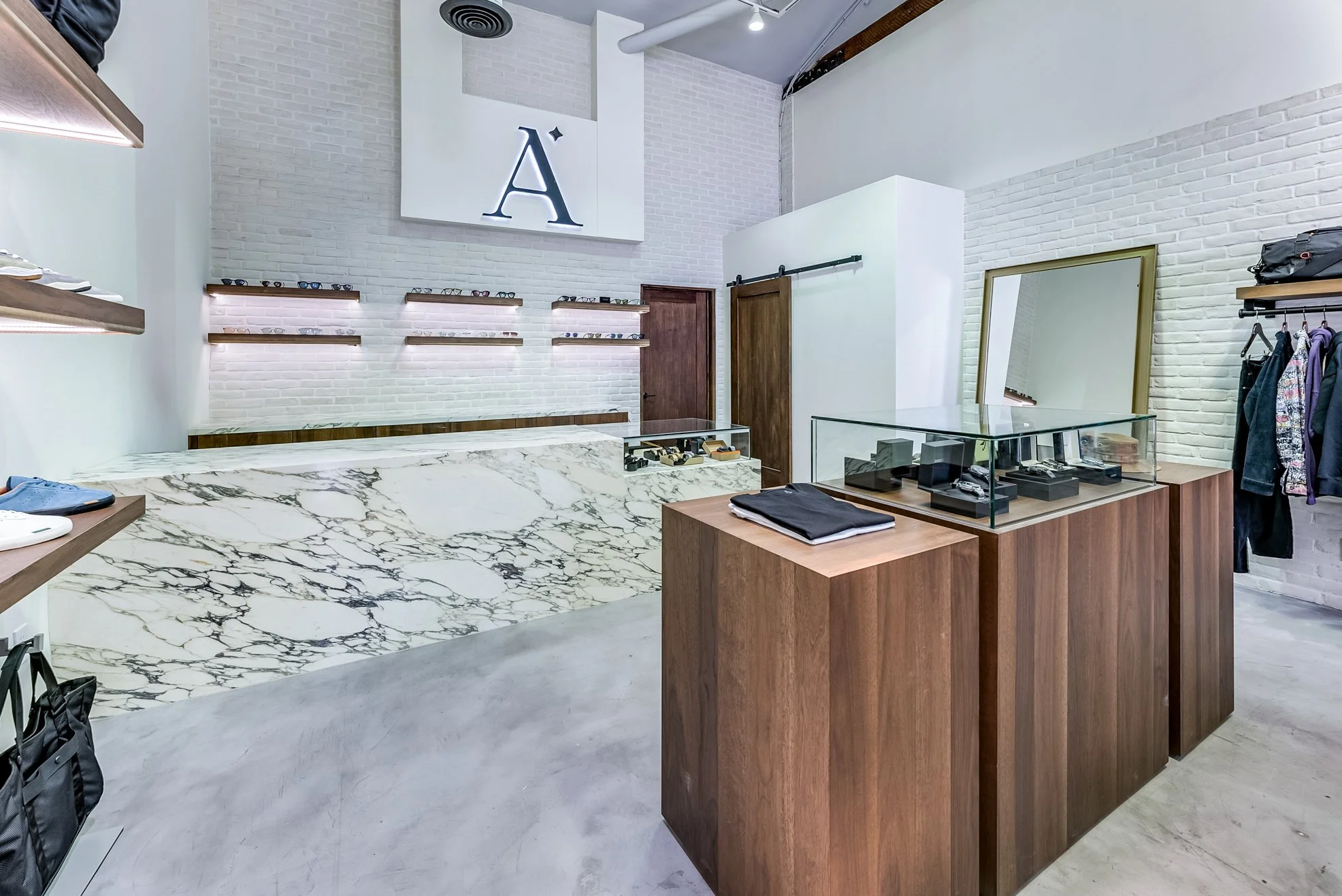
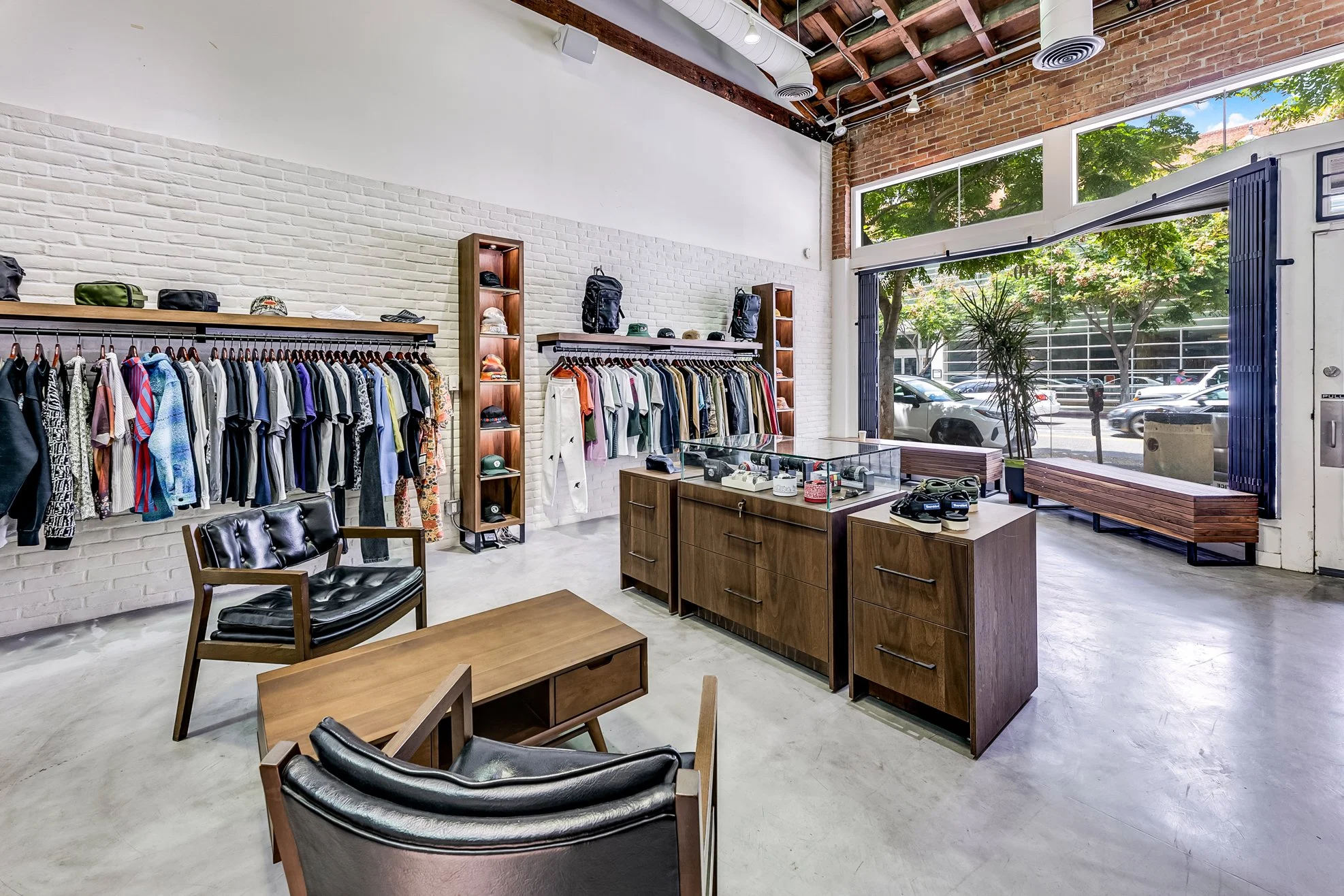
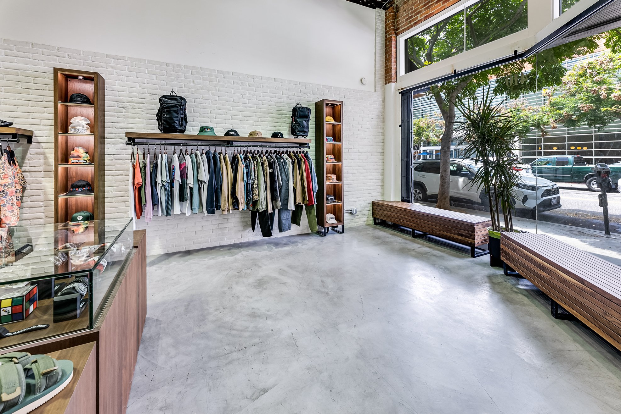
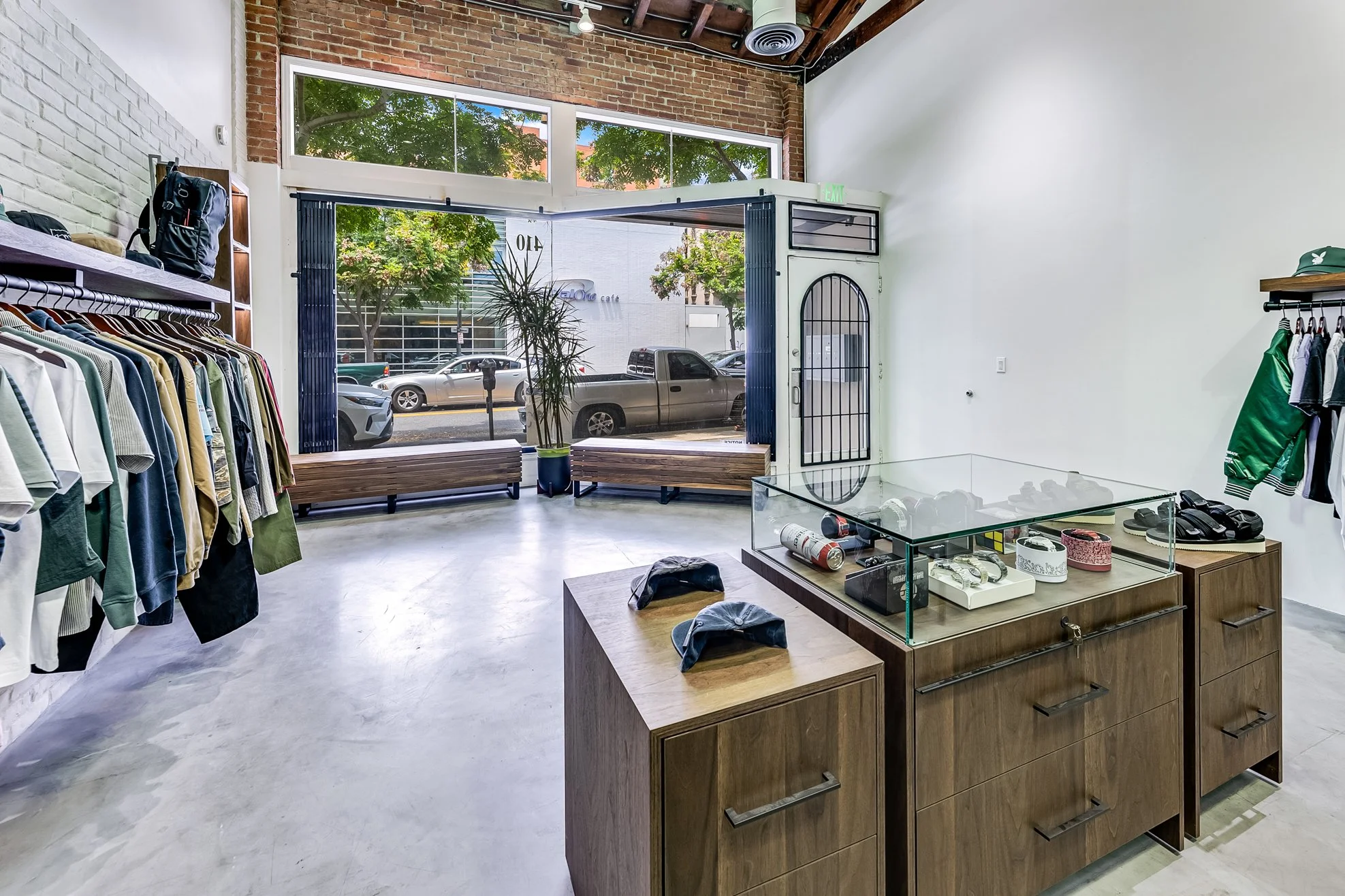
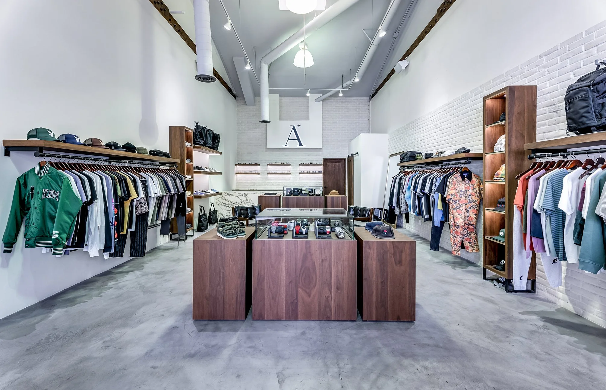
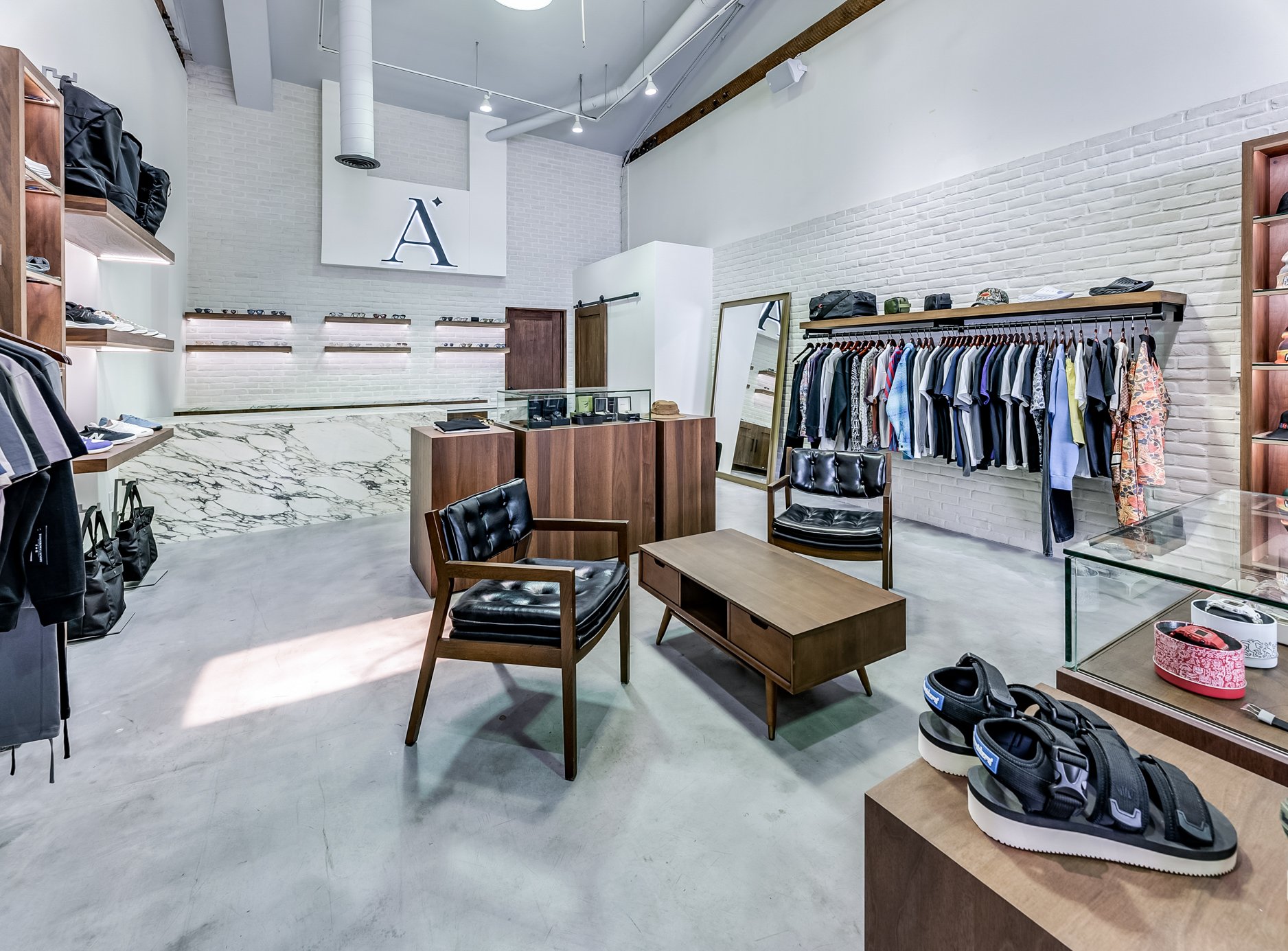
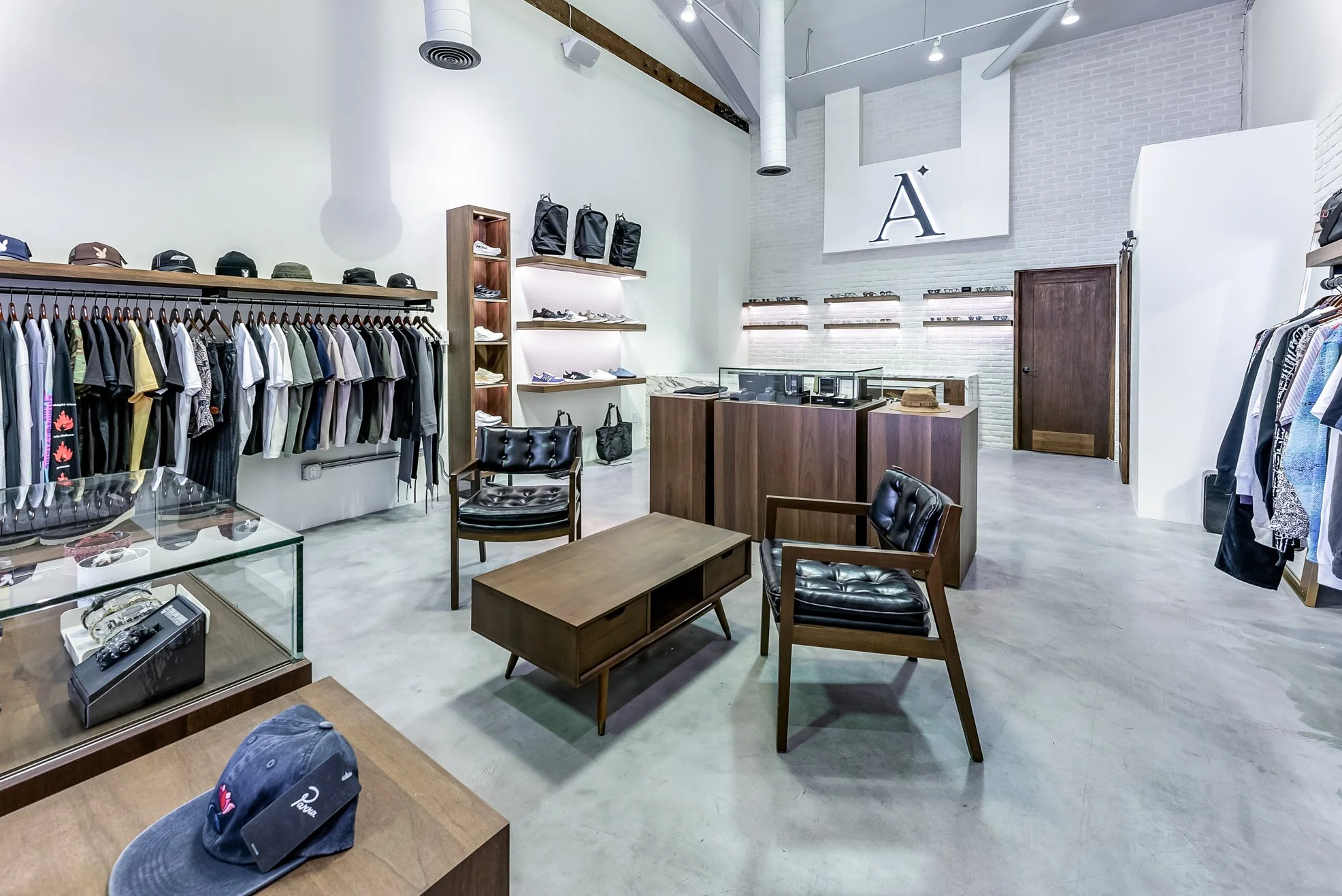
Set creative direction for seasonal collections and special projects across apparel, accessories, packaging, and advertising, while managing a team of designers across product, brand, and campaign work. Also designed the mockups and spatial/interior layout for the retail shop featured here — extending that same creative direction into physical space.
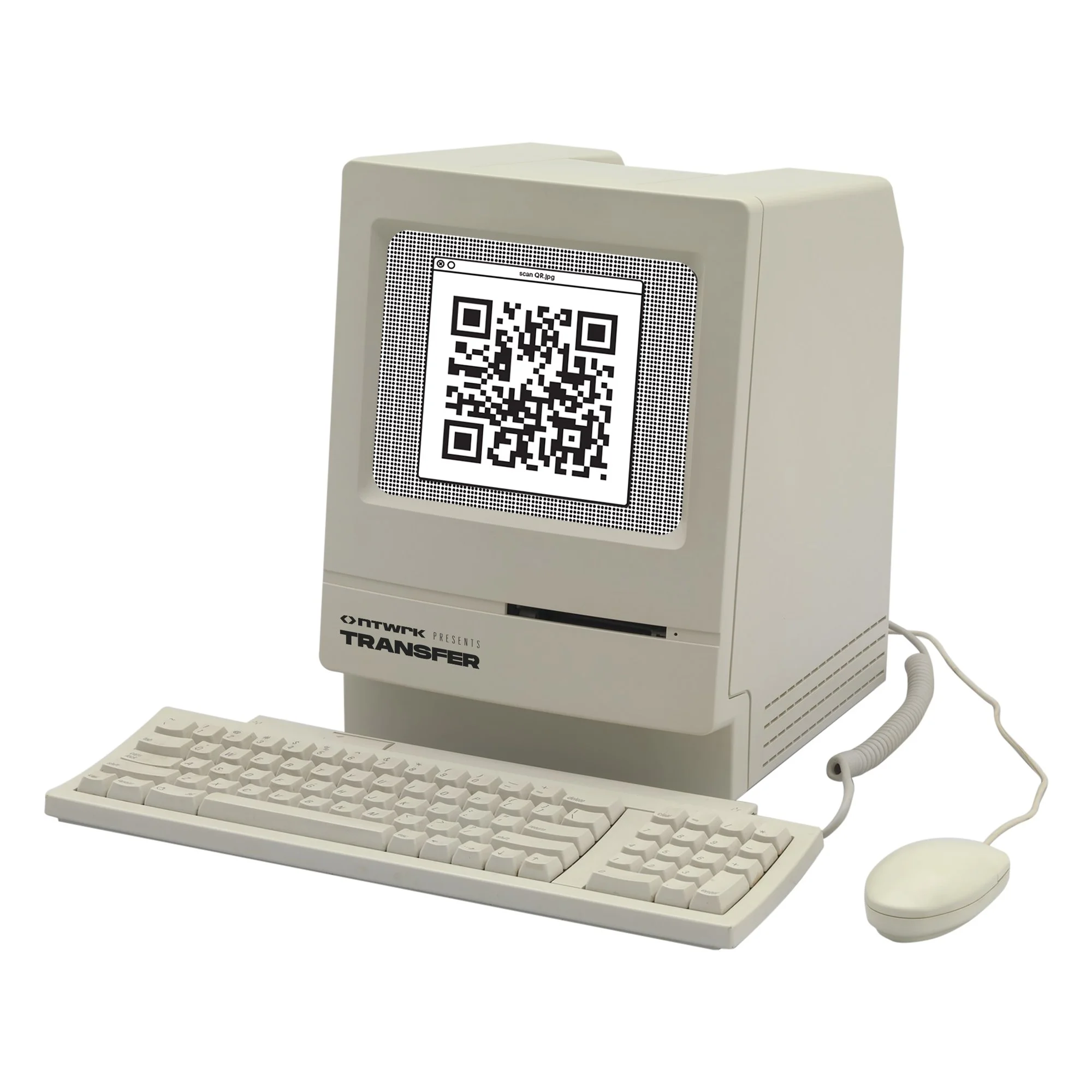
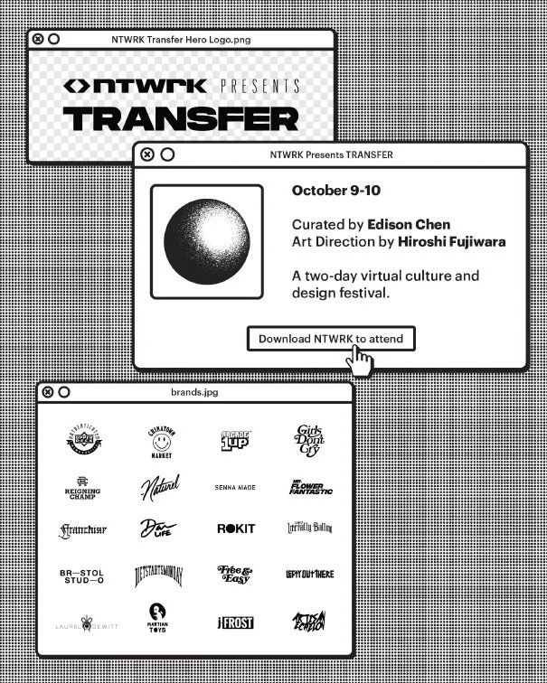
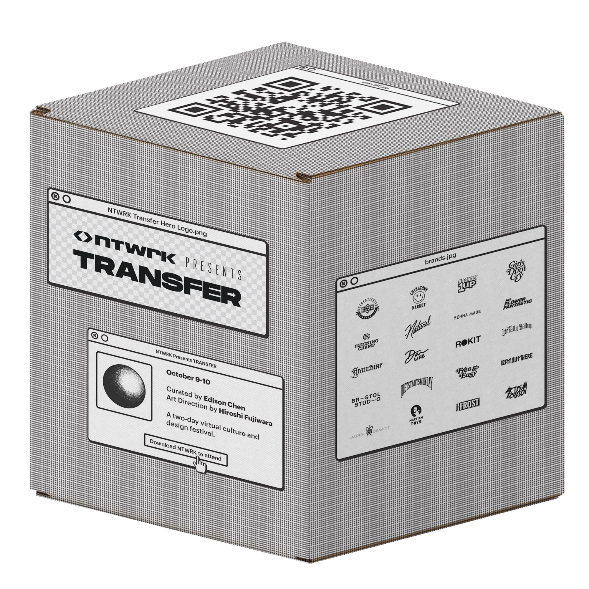
NTWRK's Transfer Festival called for creative that could hold its own in a fast-moving, culture-first environment, built for a generation that discovers brands through drops, collabs, and live digital events rather than traditional retail. The work leaned into bold, energetic visual language suited to that audience: graphics designed to move fast across social and event signage alike, while still carrying a clear creative point of view rather than just chasing trend. It's a good example of adapting a design system to a specific cultural moment without losing craft in the process.
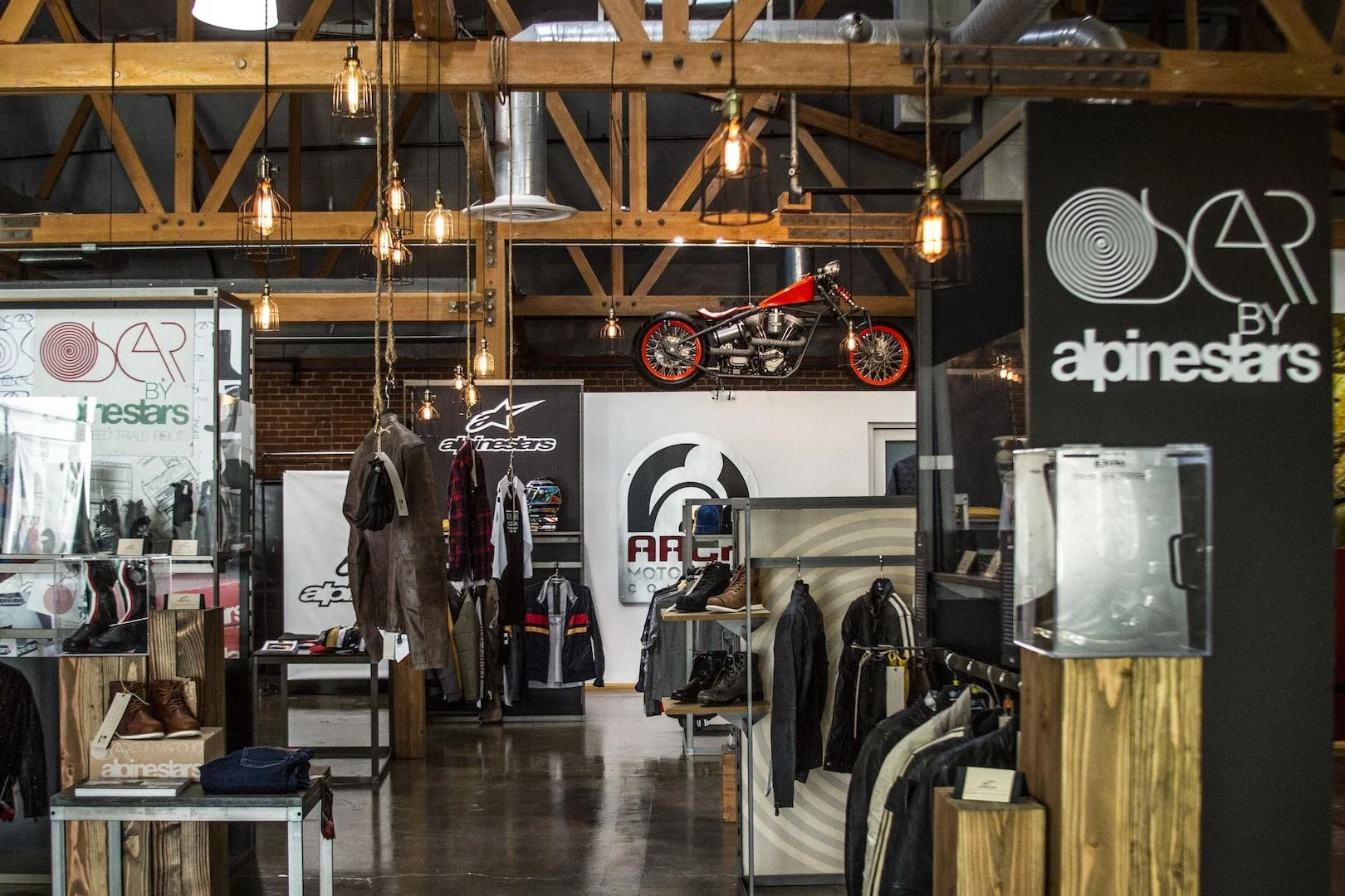
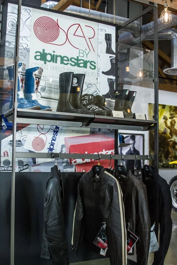
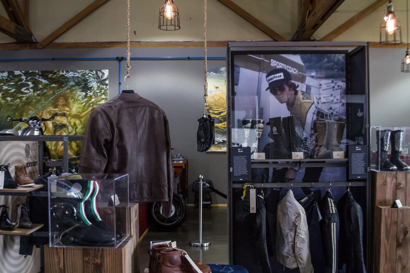
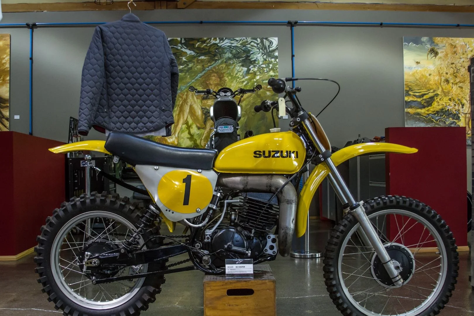
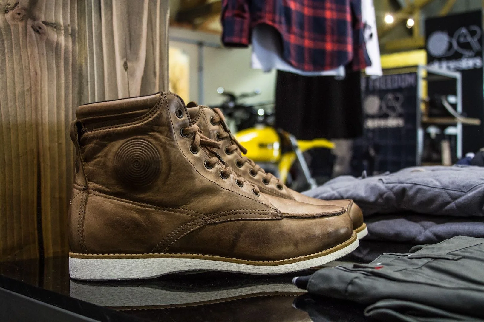
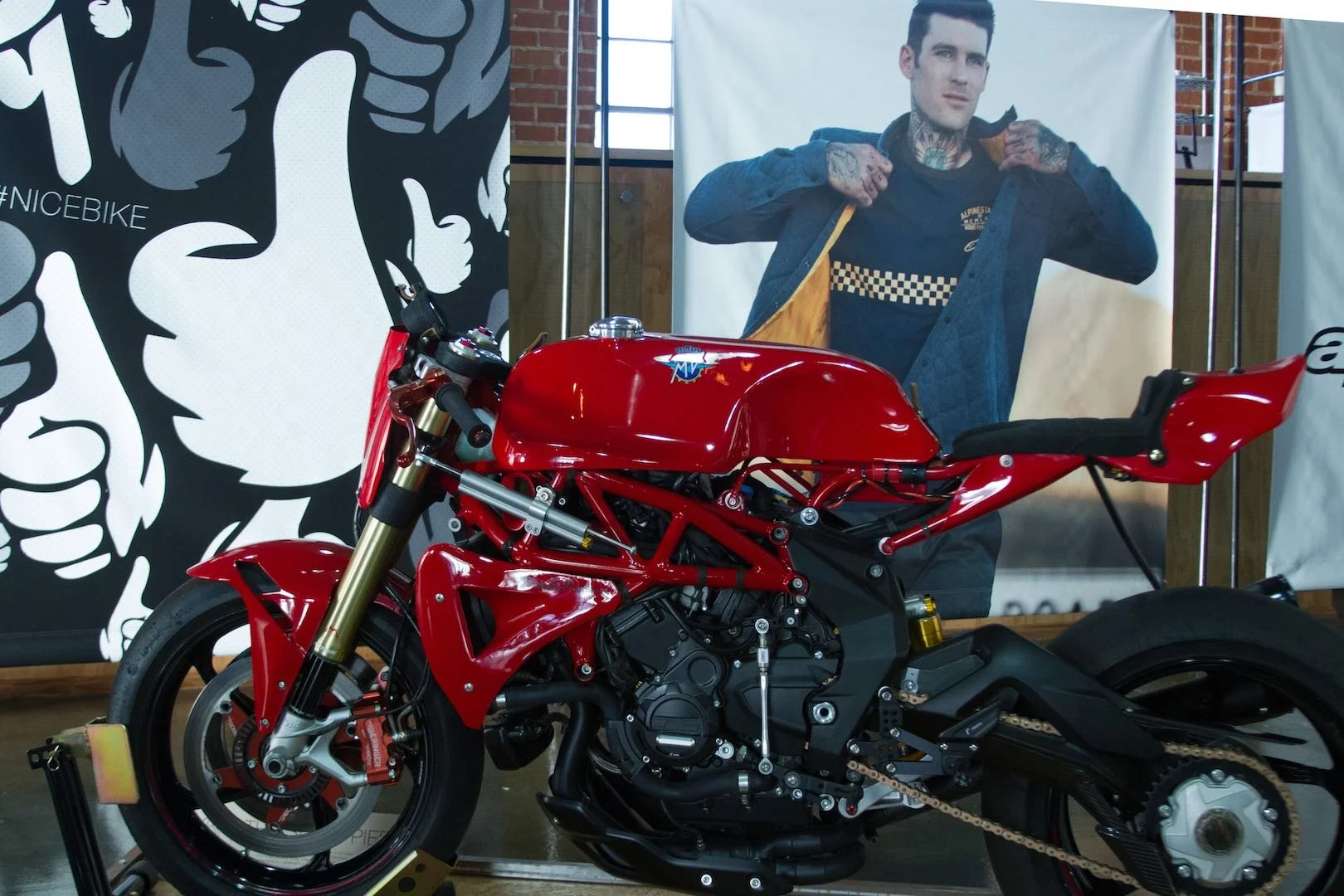
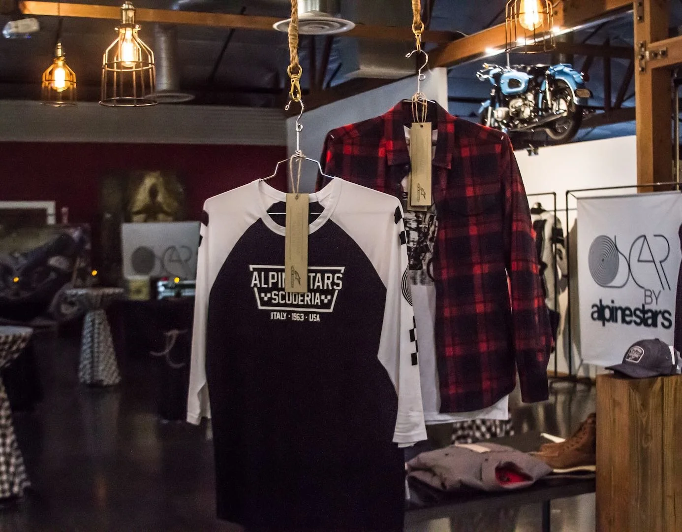
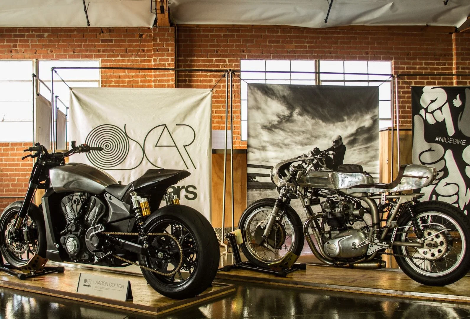
Conceptualized and executed a display to showcase the launch of Alpinestars’ Oscar collection, combining visual storytelling and product presentation to create an immersive brand experience.
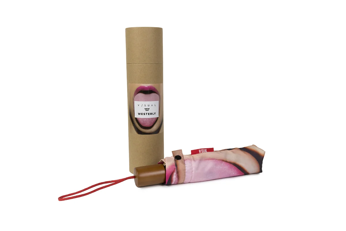
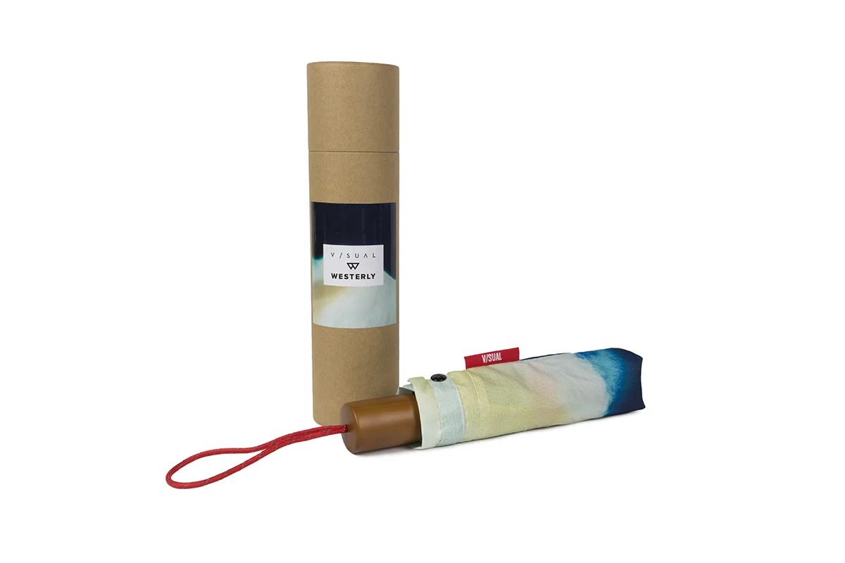
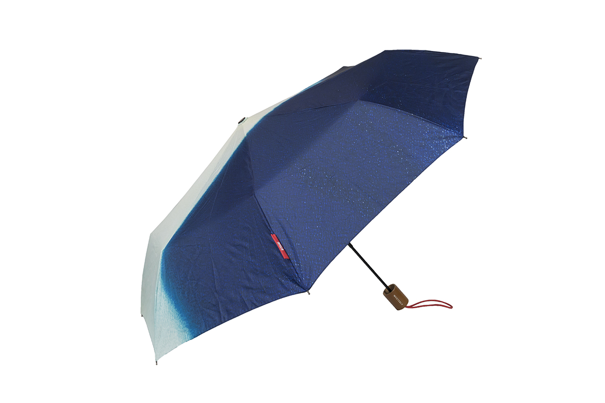
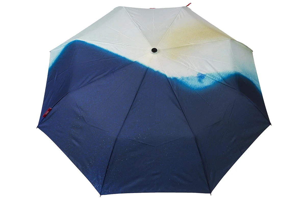
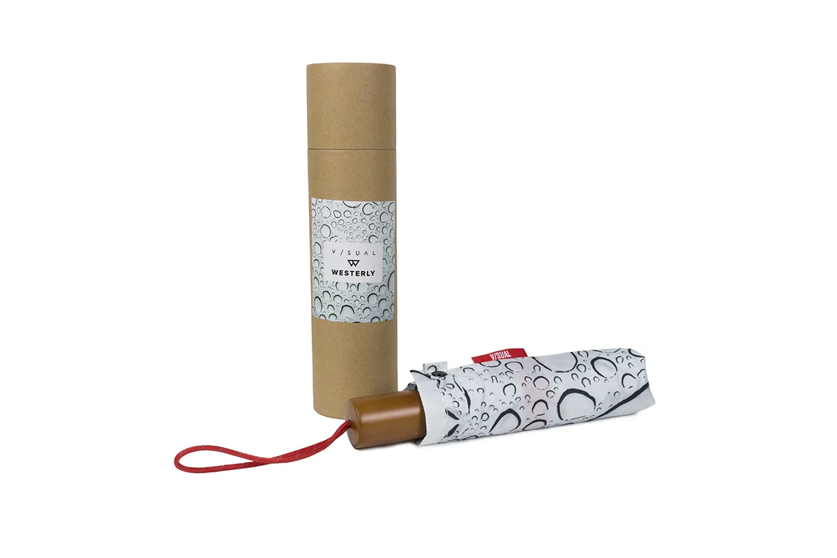
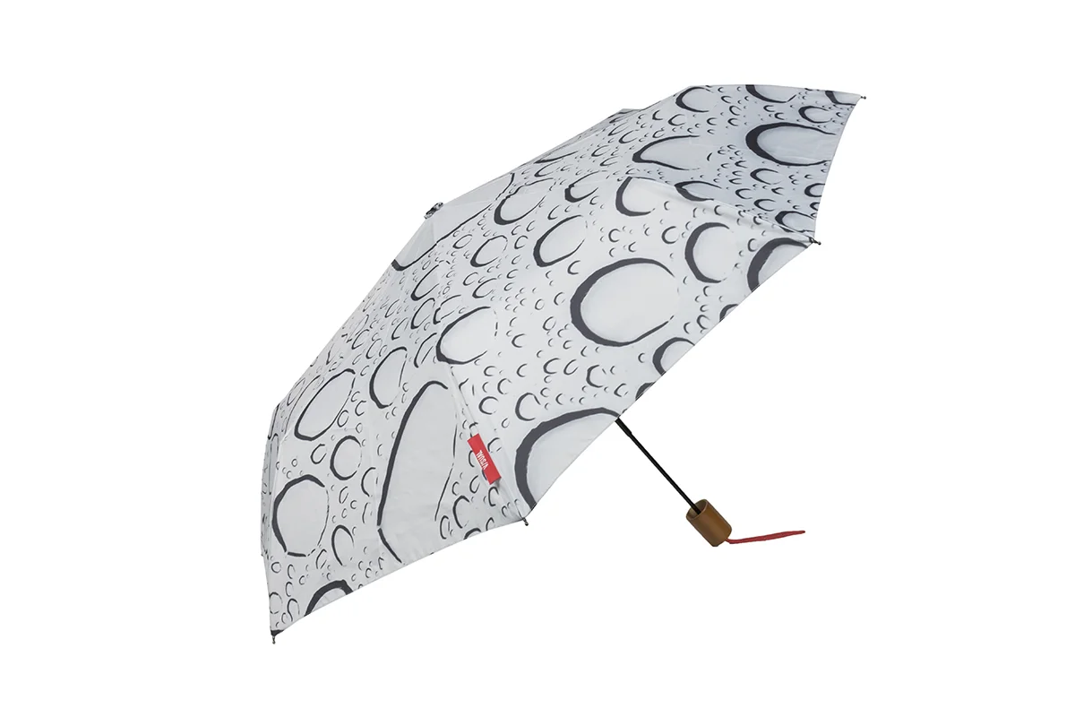
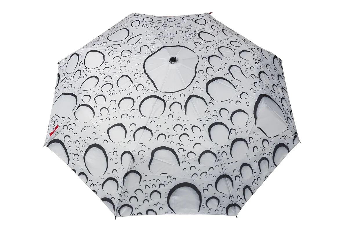
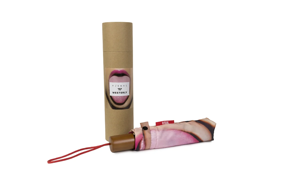
When WESTERLY engaged V/SUAL for a collaborative project, I leveraged the recent bodies of work from photographer Stephen Vanasco as a foundation for the design. The result was a cohesive collection that fused Vanasco’s photographic style with V/SUAL’s visual language, creating a visually compelling and contemporary outcome.
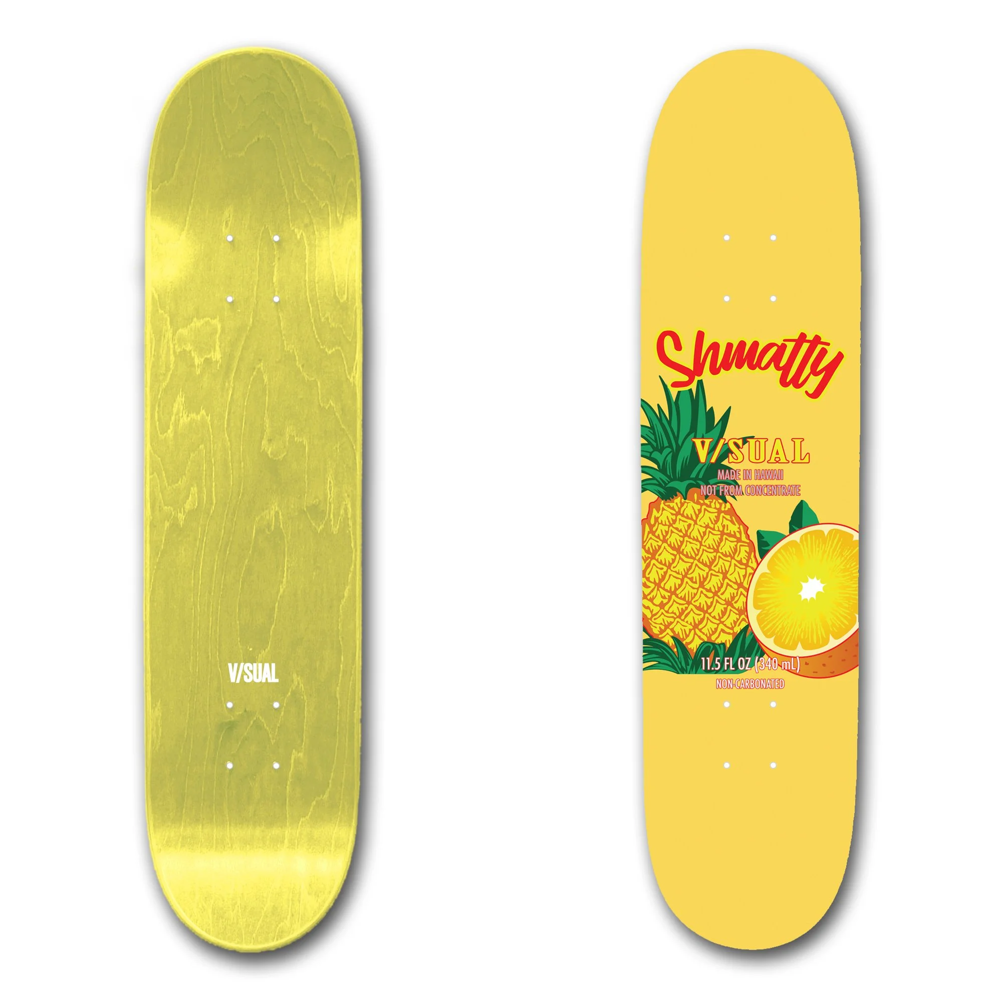
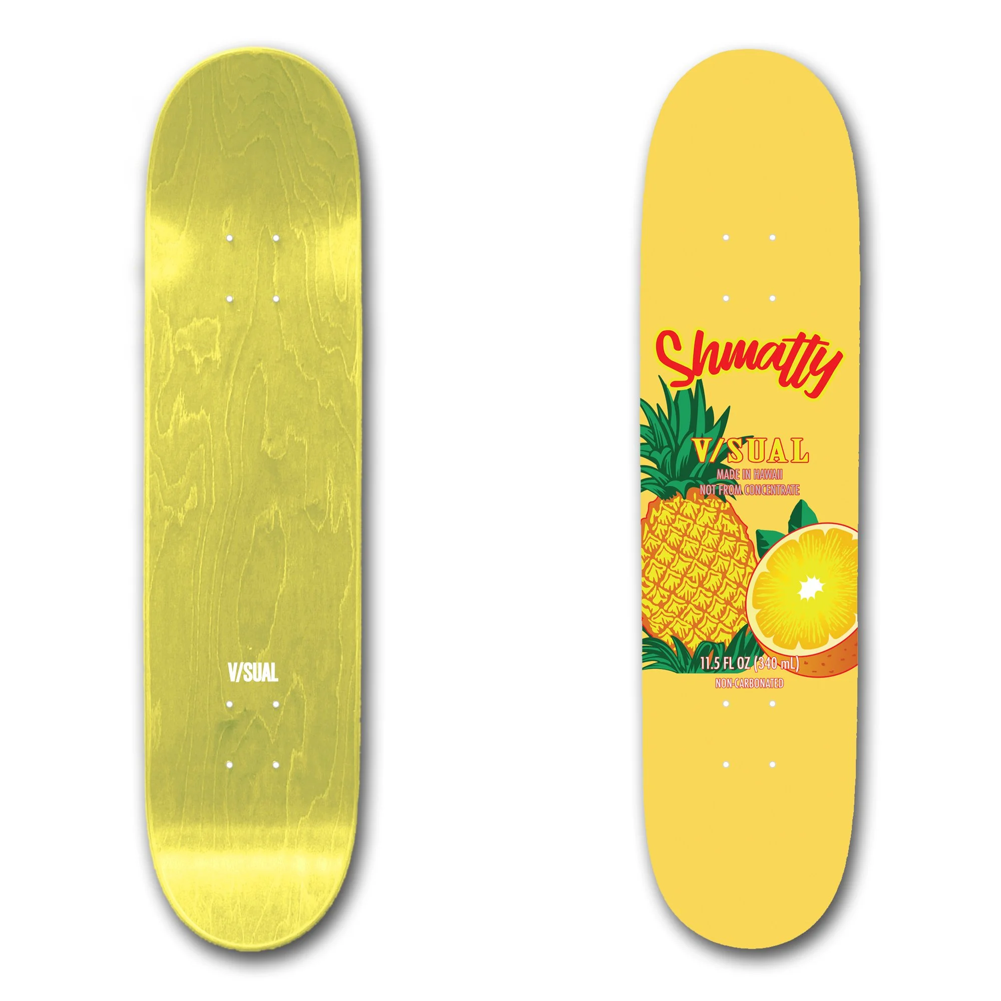
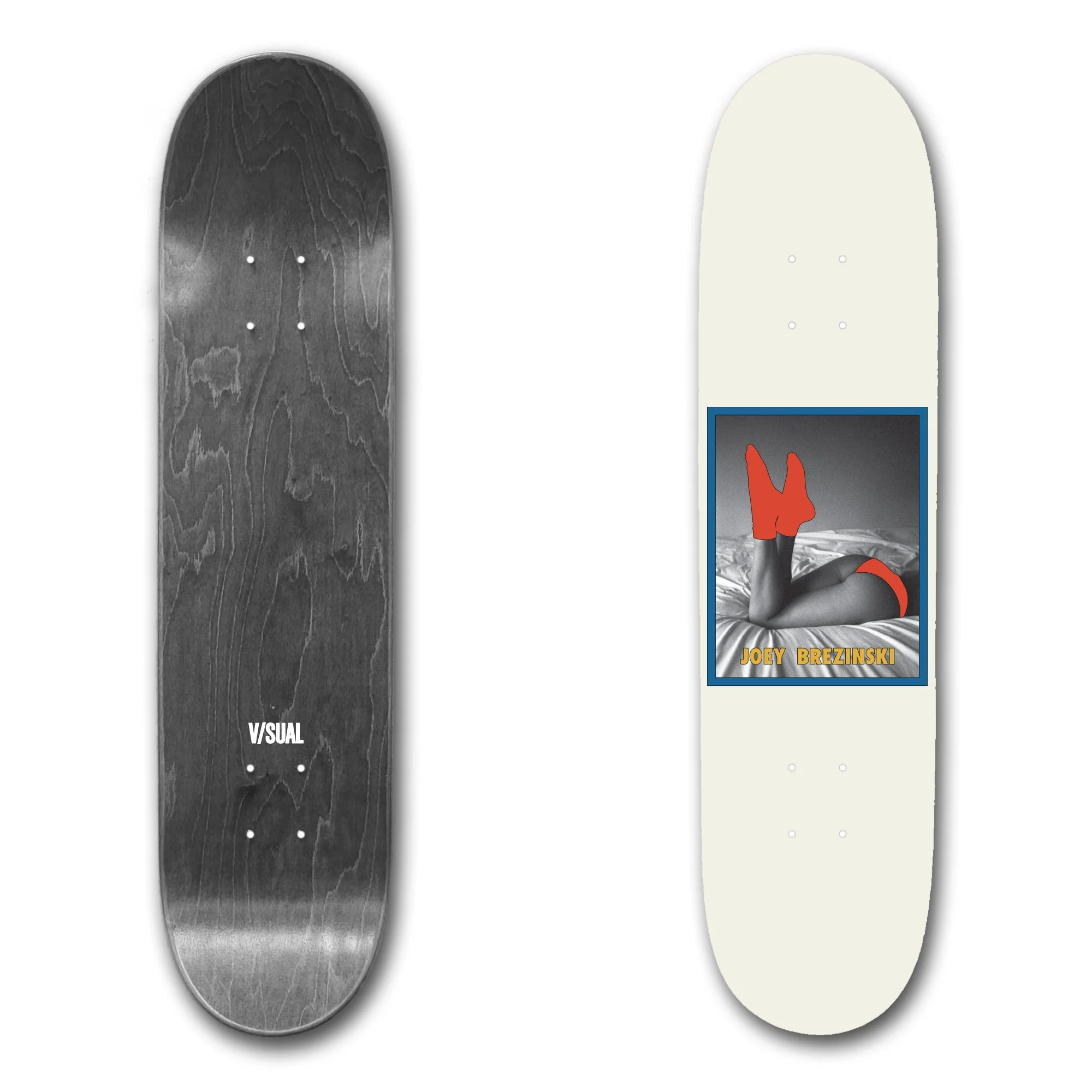
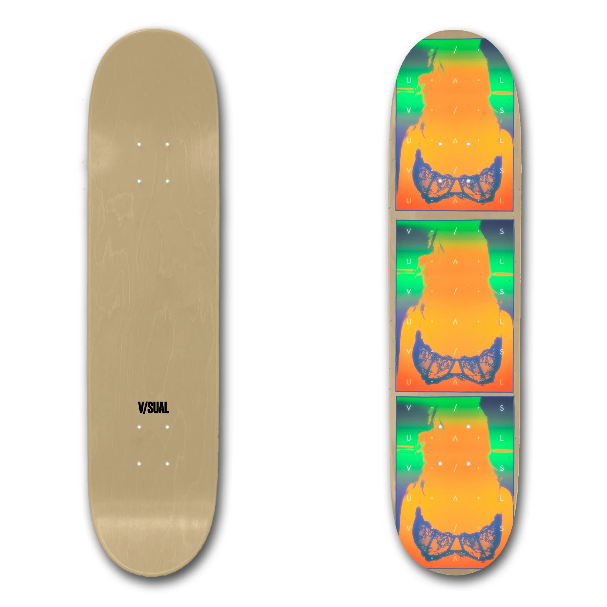
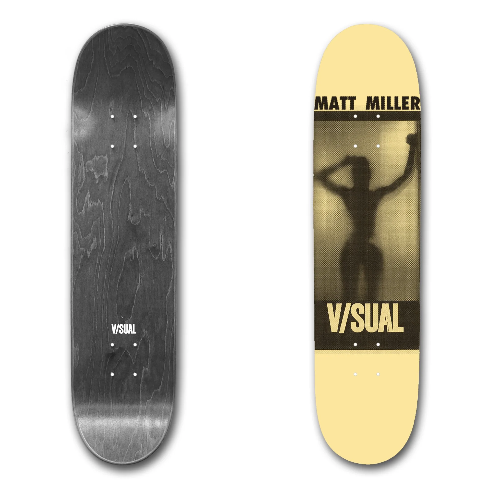
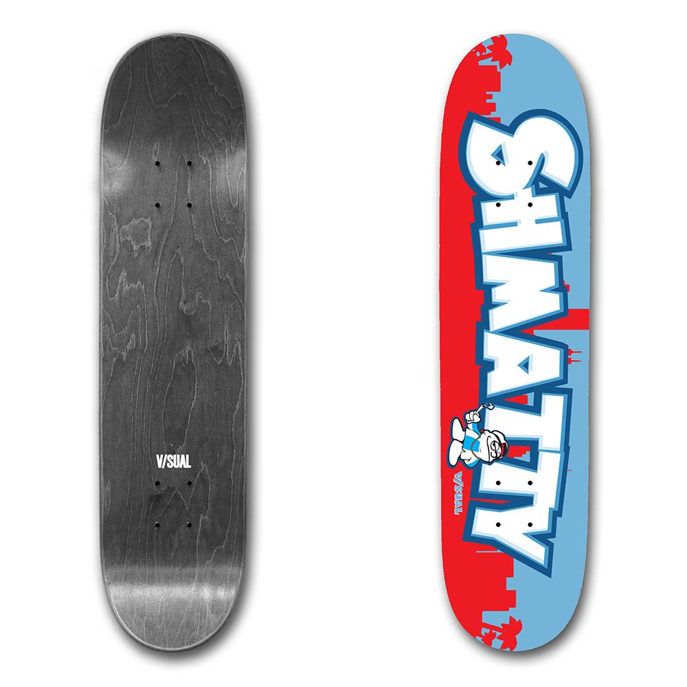
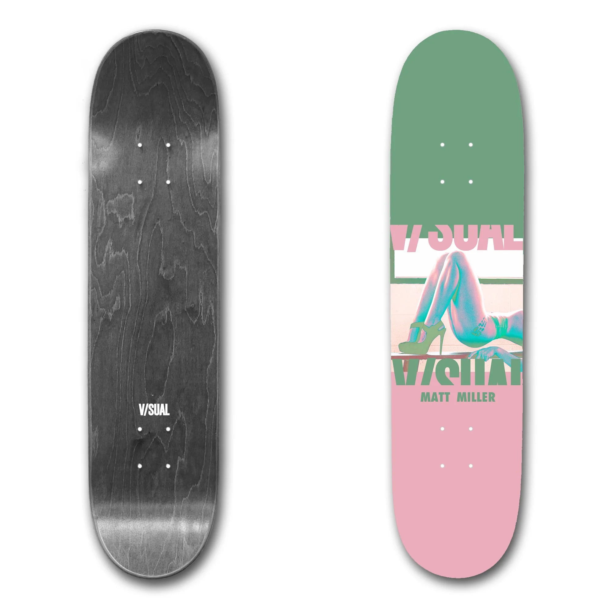
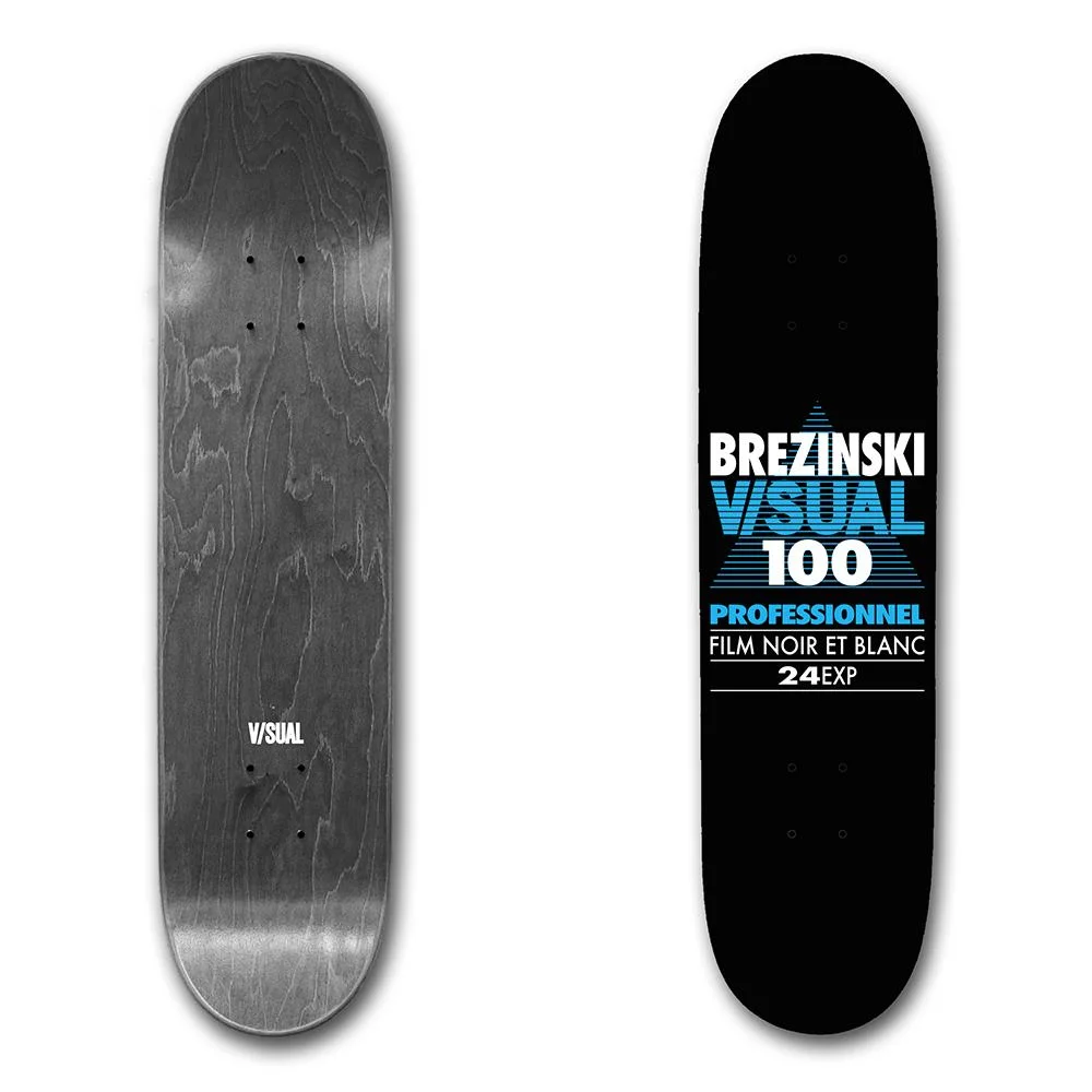
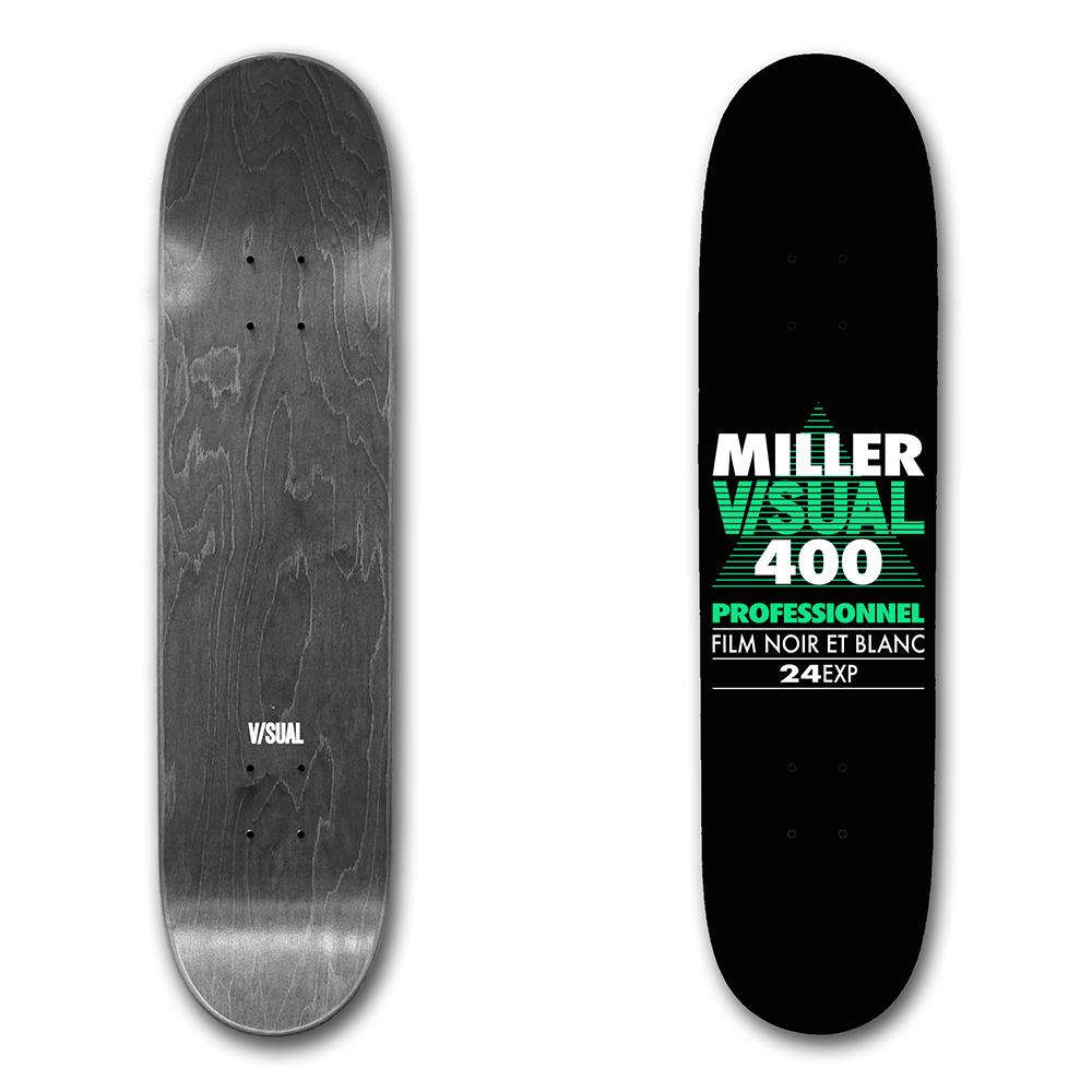
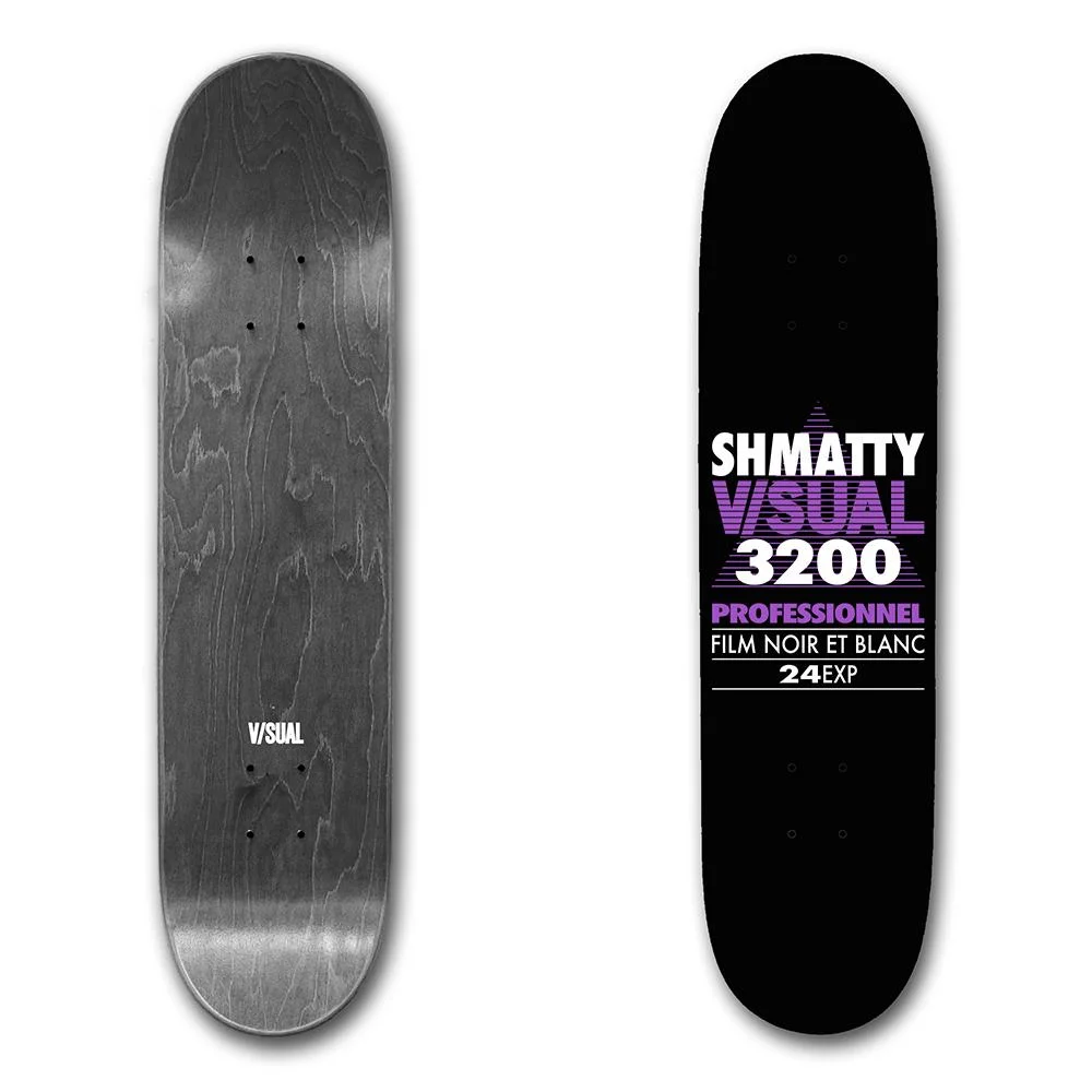
Skateboard graphics for the V/SUAL skate team, designed to showcase team identity and skate culture through distinctive visual storytelling.
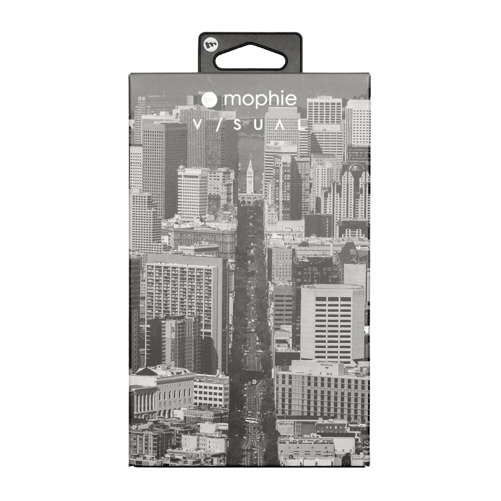
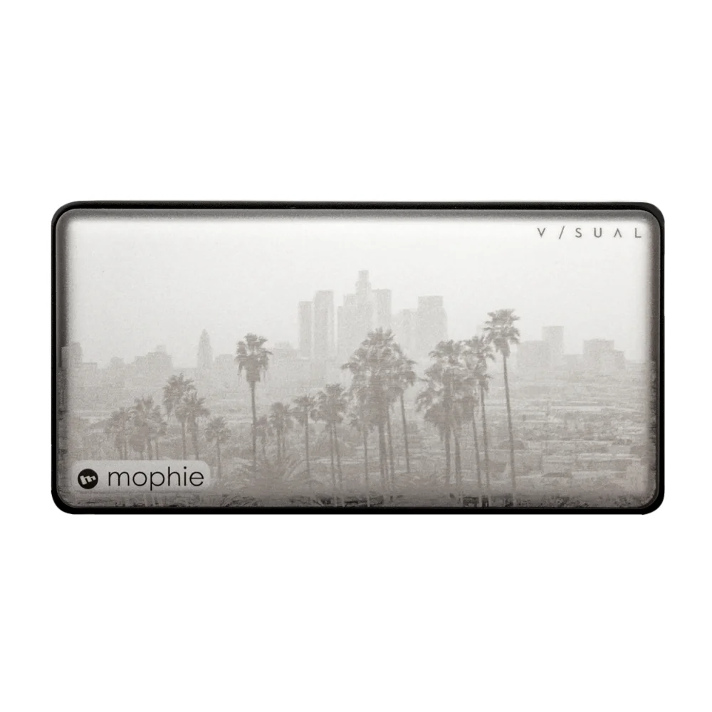
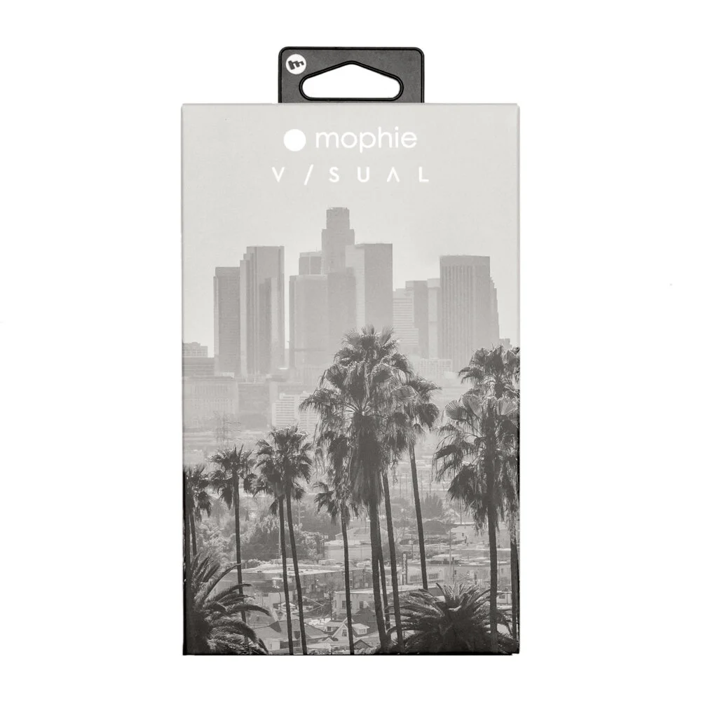
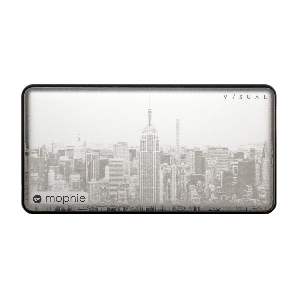
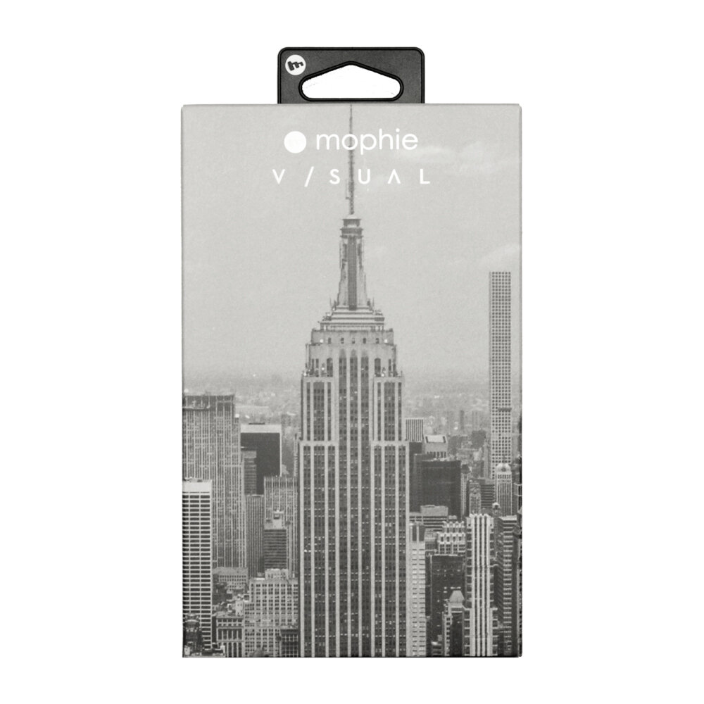
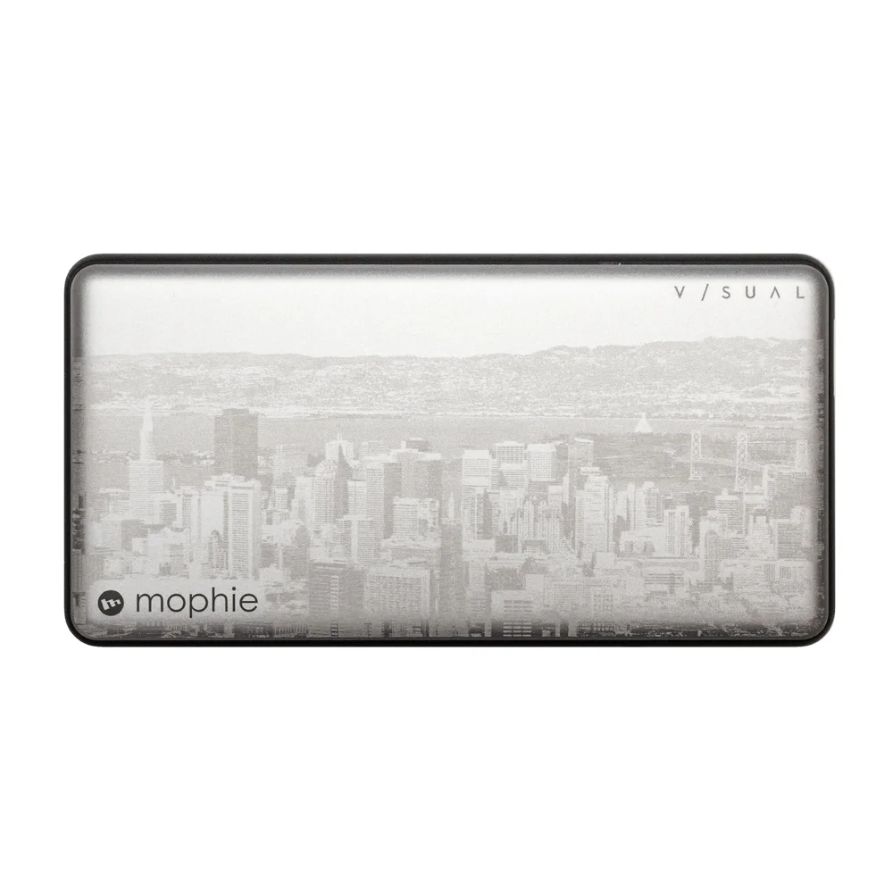
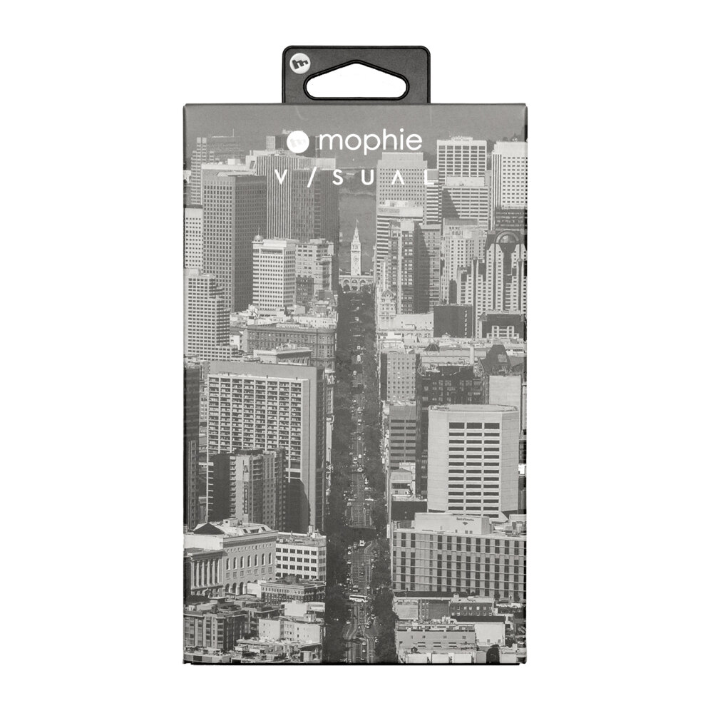
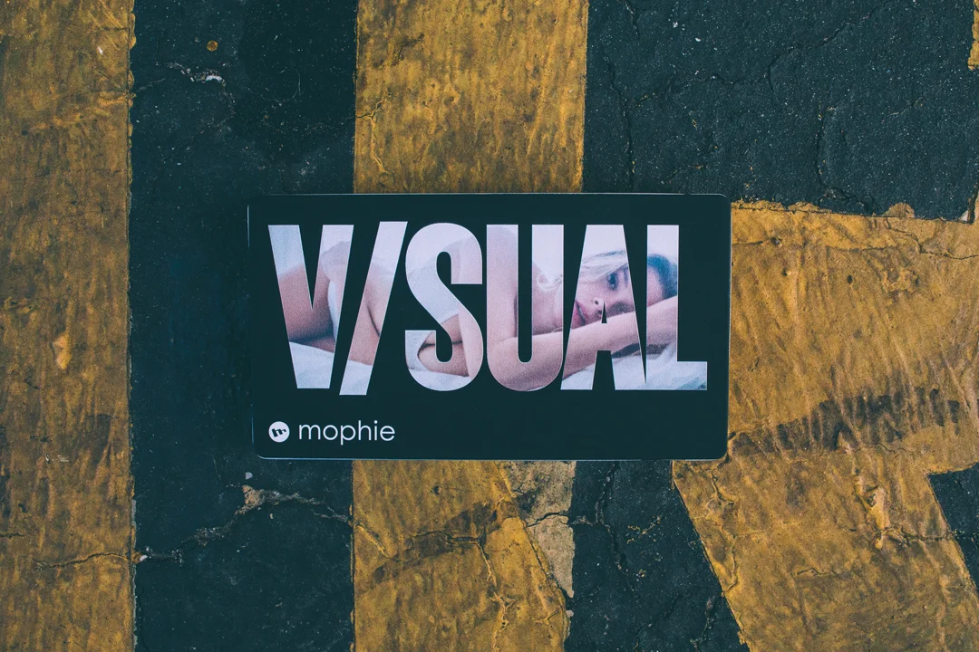
V/SUAL’s ongoing partnership with Mophie has produced numerous well-received projects. The limited edition Powerstations pictured here incorporate multiple print and engraving techniques, reflecting both creative experimentation and brand-aligned precision.
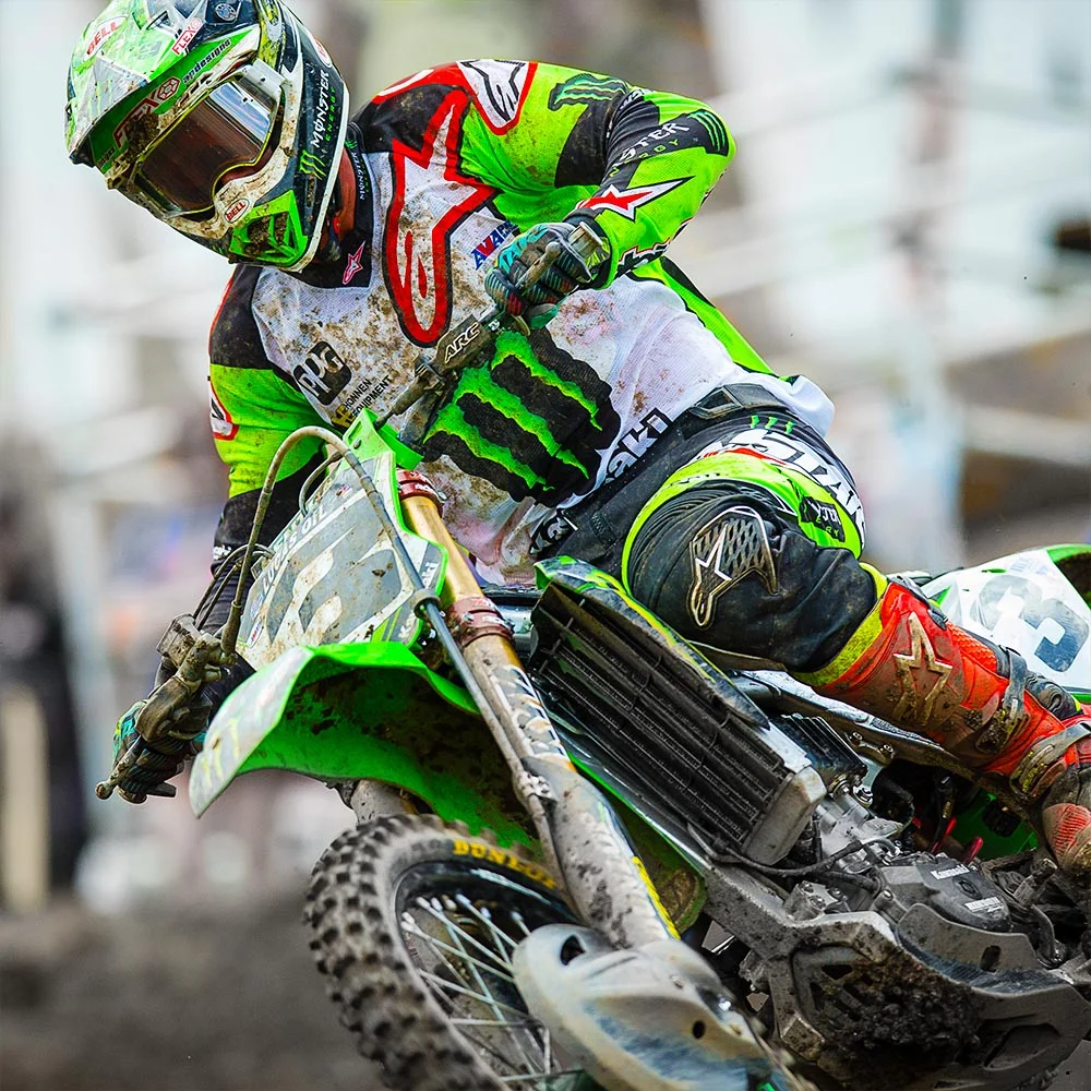
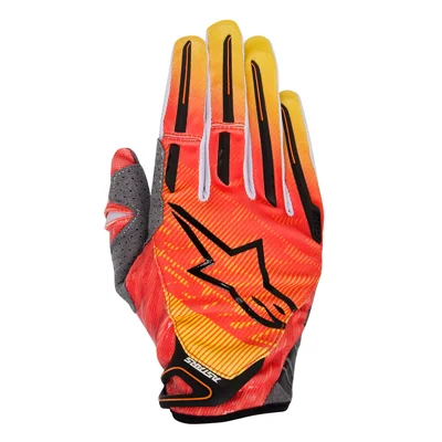
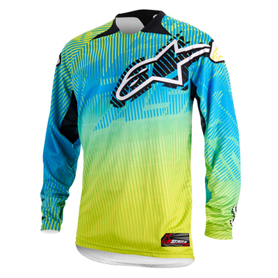
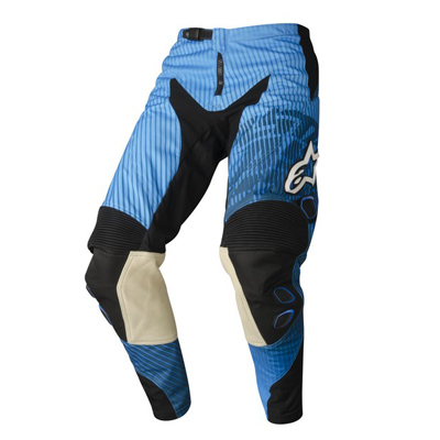
A collection of graphics created for Alpinestars’ motocross division, developed to reflect the brand’s heritage in performance and innovation. The designs explored bold visual treatments and typography to complement the energy and culture of motocross while maintaining consistency with the brand’s established visual language.
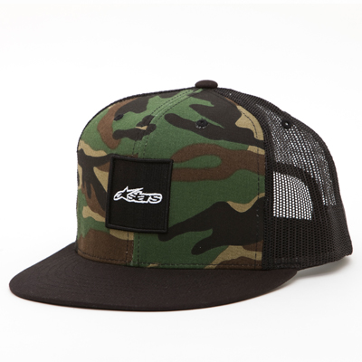
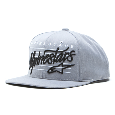
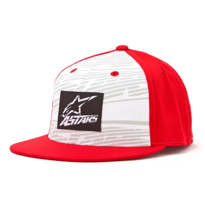
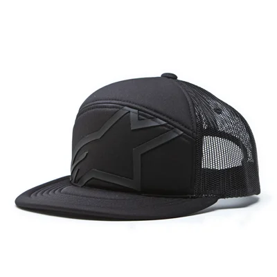
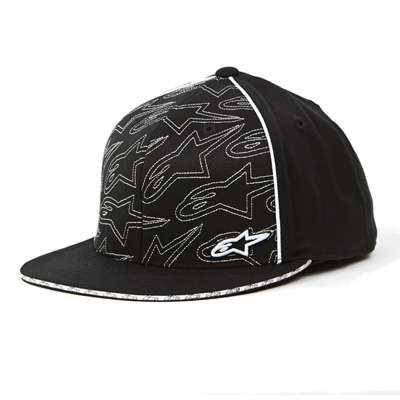
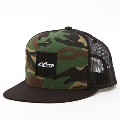
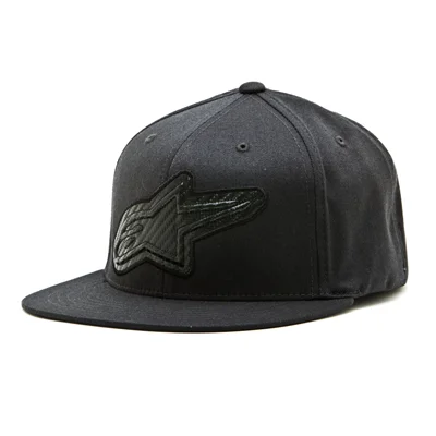
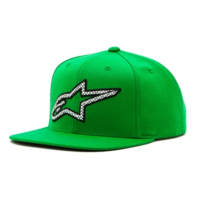
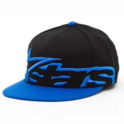
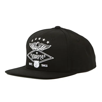
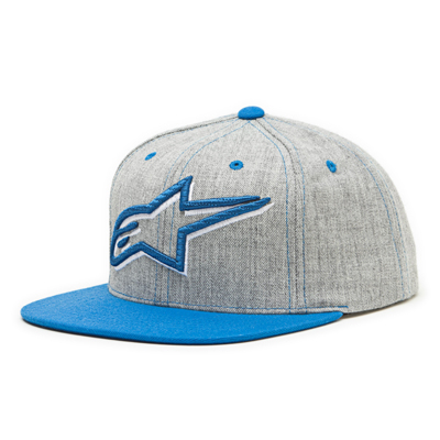
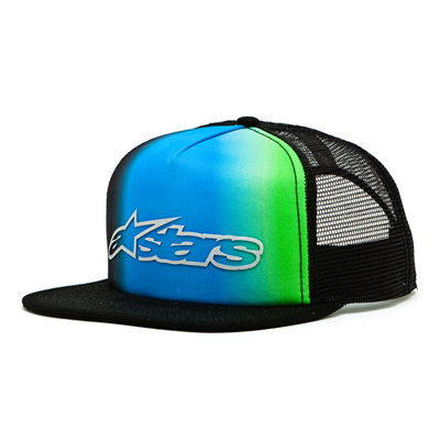
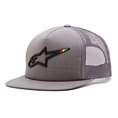
Headwear represents Alpinestars’ second largest apparel category after tees. As the brand looked to expand the division, the focus was on introducing new fabrics, updated fits, and a broader range of embroidery techniques and graphic applications. Over my six years with the company, I contributed to the development of numerous styles, with the designs shown here representing only a small sample of that work.
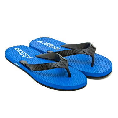
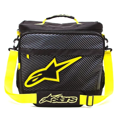
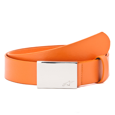
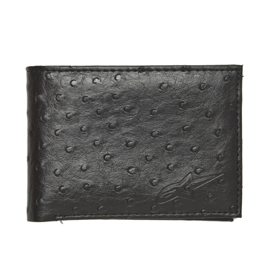
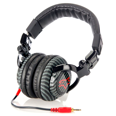
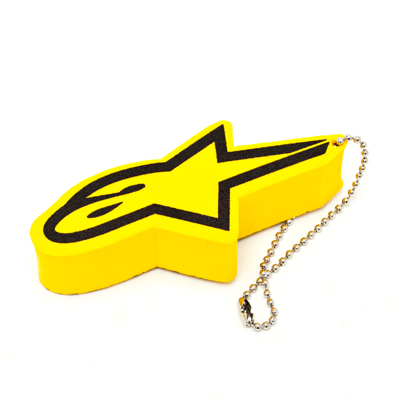
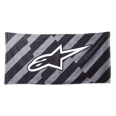
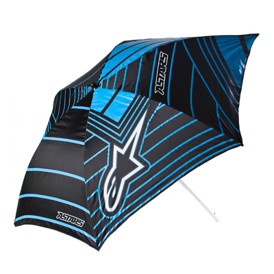
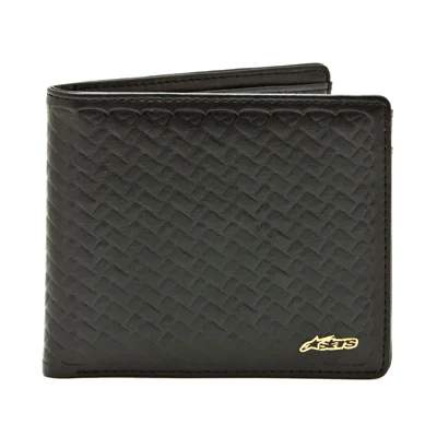
While accessories can sometimes be overlooked, they are a significant driver of sales and an accessible entry point for many consumers. I’ve always enjoyed the research and development process behind these products, from exploring materials and construction to refining graphic details that help elevate the final design.
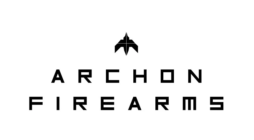
Before the ammunition packaging work, I developed the core brand identity for Archon Firearms, the logo, icon system, and overall visual language the company would carry across its product line. The goal was a mark that felt precise and disciplined, in line with the firearms category, while still being distinct enough to stand apart from the generic, utilitarian look most competitors default to. That identity became the foundation for everything that followed, including the ammunition packaging and branding shown elsewhere on this site.